What customers look for on a café or roastery website
Most people who look up a café are standing somewhere nearby with a phone in one hand. They want three answers in under ten seconds: is it open right now, what is on the menu, and how do I get there. If the menu is a photo of a chalkboard or a PDF from two summers ago, they cannot tell whether there is oat milk, whether anything is gluten-free or what a flat white costs, and they walk to the place across the street whose site told them.
Roasters have a second, slower visitor: the home brewer. They read tasting notes, compare origins and processes, check how light or dark a roast is, and care a lot about freshness. A coffee page without a roast date looks like supermarket coffee. A coffee page with the date, the process, a clear roast level and a suggested brew ratio looks like someone who knows what they are doing, and it sells the second bag as well as the first.
The third visitor is a business. Café owners, restaurants and office managers looking for a local roaster want to know what you supply, how often you deliver, whether you train staff and how to ask for a price list. That page rarely gets much traffic, but every enquiry from it can be worth more than a month of takeaway cups.
How the demo handles it
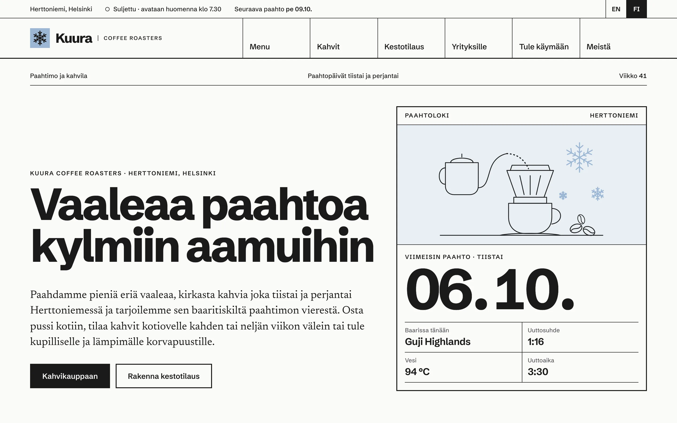
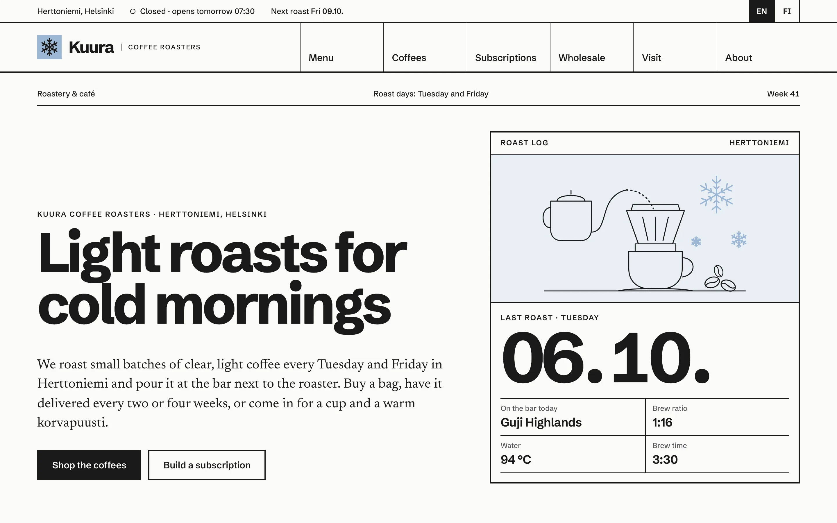
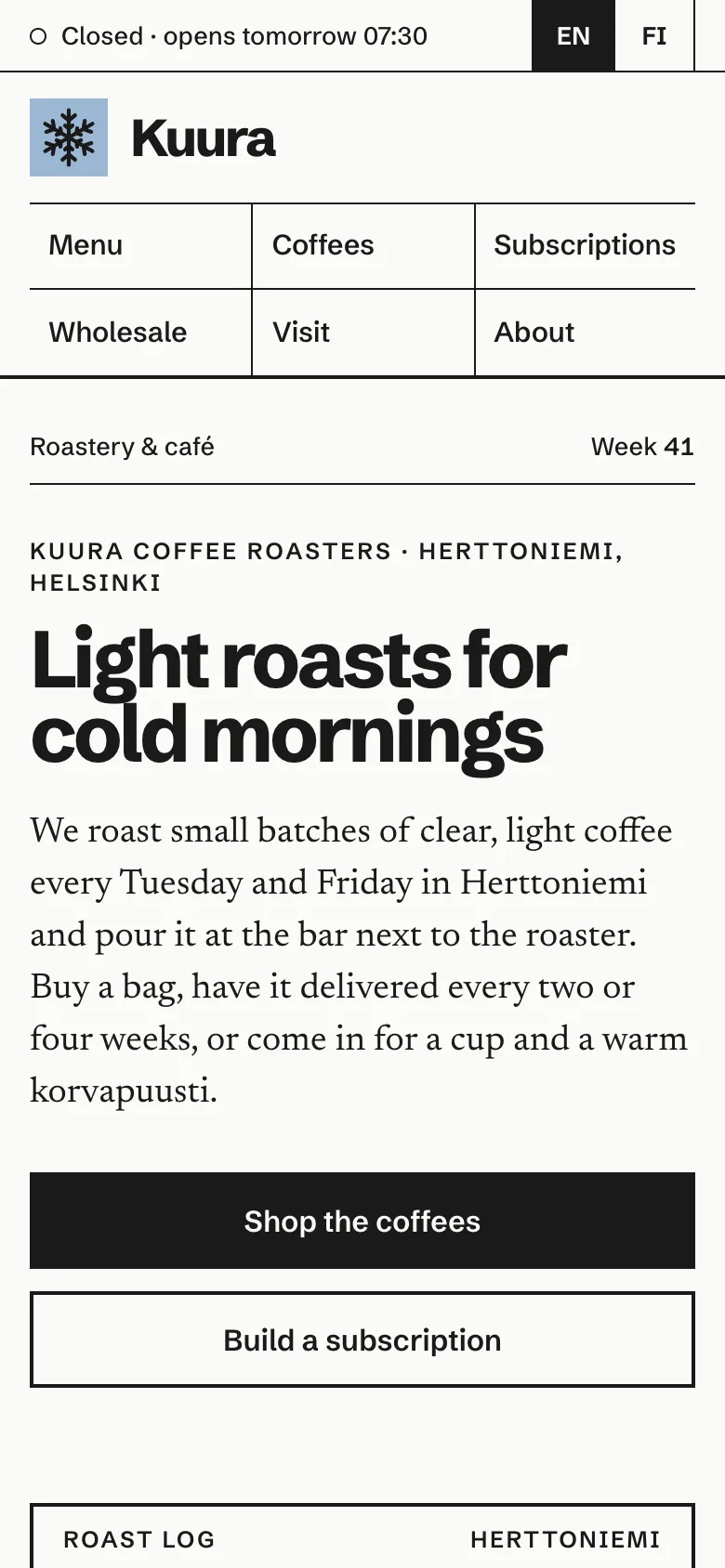
The demo for the fictional Kuura Coffee Roasters in Helsinki is built around numbers, because coffee people trust numbers. A status strip at the top of every page says whether the café is open right now, using Helsinki time, and when the next roast is. The home page opens with a roast log card: the date of the last roast in big figures, the coffee on the bar and its brew ratio, water temperature and time. Below it, the house recipes for filter, espresso, pour-over and cold brew are shown as ratios, so the menu and the shop speak the same language.
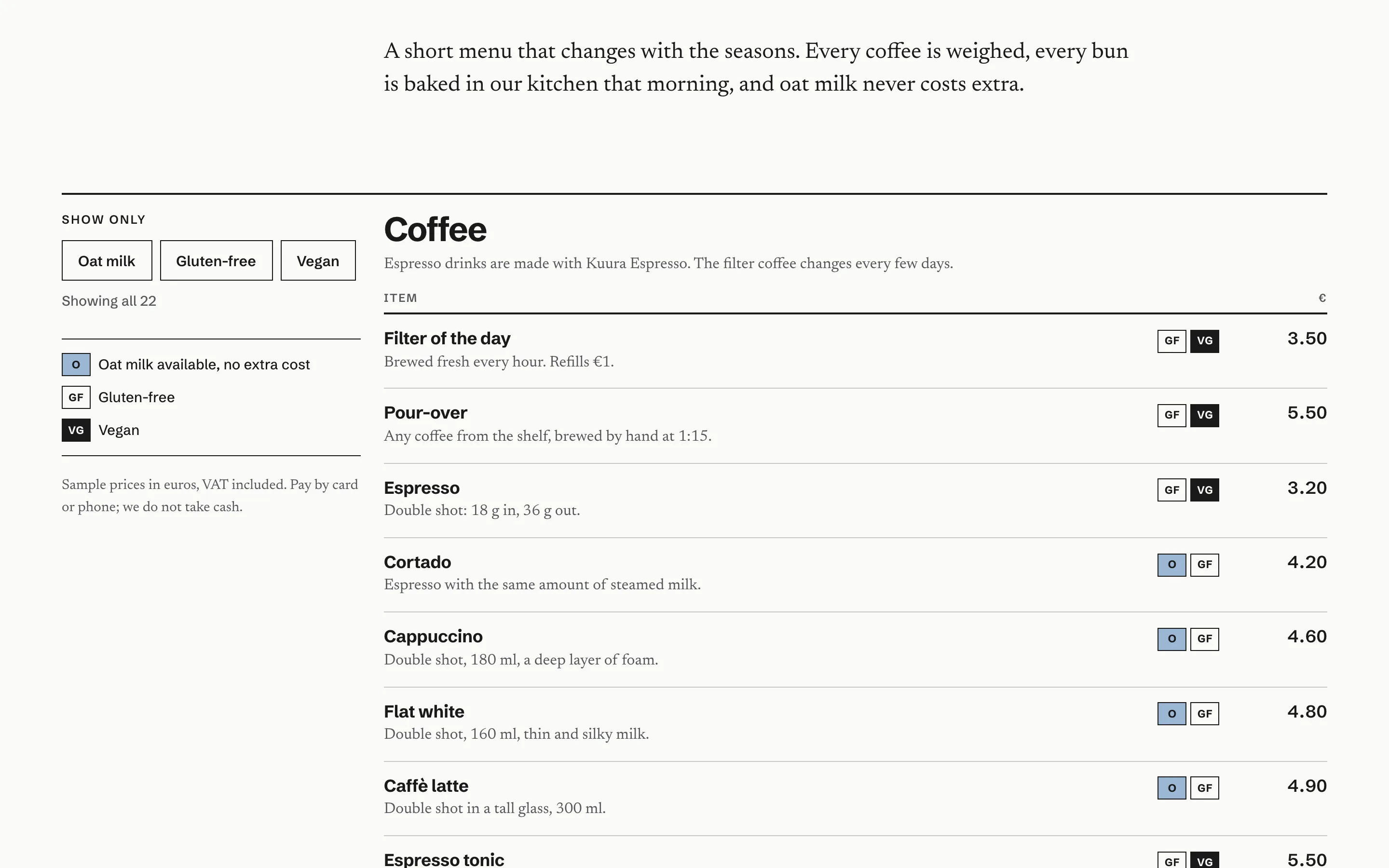
The menu has a marker on every item for oat milk, gluten-free and vegan, and three filter buttons that hide what does not match and say how many items are left. Prices sit in a tidy column, and an allergies section explains honestly what the kitchen can and cannot promise.
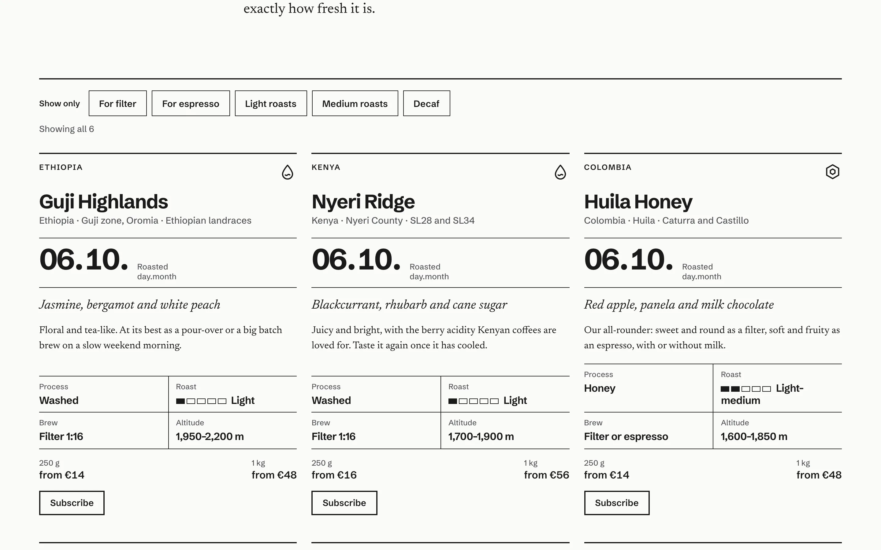
Each coffee is a product card with country, region, variety, process, a five-step roast meter, tasting notes in italics, the altitude, the day it was roasted and "from" prices for 250 g and 1 kg. Visitors can filter for filter or espresso coffees, light or medium roasts, or decaf.
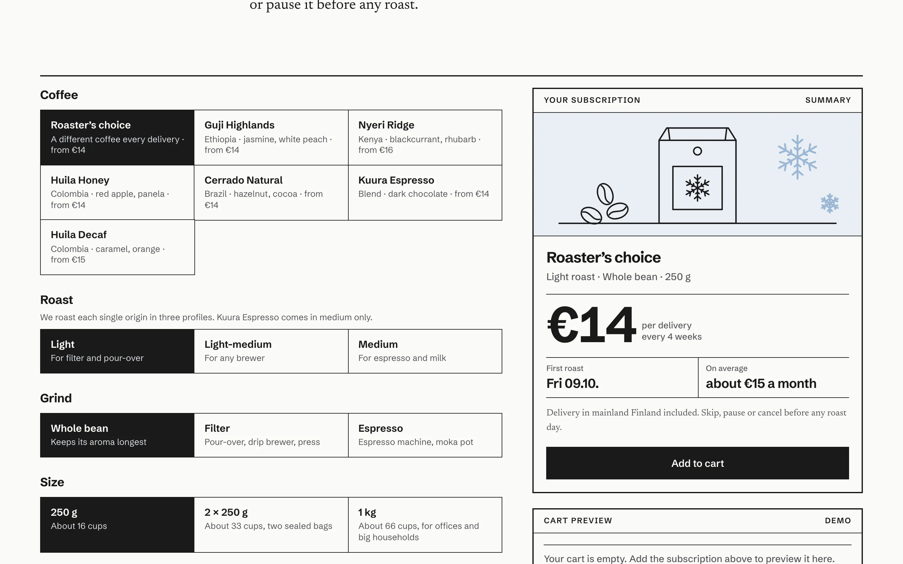
The subscription builder is the part that earns repeat revenue. Visitors pick a single coffee or roaster's choice, then the roast, the grind (whole bean, filter or espresso), the bag size and delivery every two or four weeks. A summary card updates as they go, with the price per delivery, a monthly estimate and the date of the first roast. Choosing the espresso blend locks the roast to medium, because that is the only way it is roasted. "Add to cart" fills a cart preview that survives a page reload, and checkout ends on a clearly labelled demo screen with a placeholder where the payment provider's own checkout would open. No card fields are ever shown.
Pages included
Home, Menu, Coffees, Subscriptions, Wholesale, Visit and About, each in English and Finnish, plus a bilingual not-found page. The Visit page shows the week's hours with today highlighted, an illustrated map of the area rather than a pin on a real building, seating, Wi-Fi and laptop rules, and a practical accessibility list. About explains the roasting approach with a line drawing of the roaster and a single light roast broken into five timed stages, from charge to drop. Wholesale covers cafés and offices separately, shows a four-week onboarding plan and ends with an enquiry form that validates every field and then confirms that, in the demo, nothing was sent.
Local SEO set-up
Every page carries one JSON-LD graph that describes the business as a CafeOrCoffeeShop with its city, service area, opening hours, menu link, logo and share image. The menu page adds a Menu with sections and items, including prices and suitable diets. The coffee page lists each coffee as a Product with its process, roast level and altitude as properties and a "from" offer, and the subscription and wholesale pages add their own Product and Service. Inner pages have a BreadcrumbList, and the home page an FAQPage. Review and rating markup is never added to a demo.
Titles pair the offer with the place ("Coffee Roastery and Café in Helsinki"), and each page targets its own search: the menu for café searches nearby, the coffees for people buying beans online, the subscription page for "coffee subscription" searches, and wholesale for businesses. For a real client, the next steps are a Google Business Profile in the café category with the same hours and a menu link, real photos of the room and the bar, and a short post every time a new coffee arrives.
Café and roaster websites by country
Finland
Finland drinks a lot of coffee and expects it to be light, so roast level and roast date are worth showing up front. The site is in Finnish and English with hreflang between the pairs, prices use the Finnish format (14 €, 3,50 €), times use the Finnish style (7.30–18.00), and the oat drink is called "kaurajuoma" on Finnish pages. The Y-tunnus goes in the footer, and EU accessibility rules make WCAG 2.2 AA the right standard.
India
India's specialty coffee scene is growing fast, with estates in Karnataka, Kerala and Tamil Nadu and roasters selling online to home brewers across the country. The site uses Indian English and rupees, shows the estate and region on each coffee, offers WhatsApp as the main contact button and mentions UPI at checkout. A GST number placeholder belongs in the footer, and delivery promises should name the cities and pin codes you really serve.
USA
American visitors compare roasters online before they ever taste the coffee, so tasting notes, process and roast date carry a lot of weight. The site uses US English, dollars and ounces or pounds next to grams, explains shipping times by region, and handles subscriptions with the payment service you already use. WCAG 2.2 AA accessibility also lowers the risk of ADA complaints.
Canada
Canadian cafés need opening hours that change with the seasons and, in Quebec, a French version of the site, which the same bilingual set-up supports. Prices are in Canadian dollars, weights are metric, and the menu can carry the allergen notes Canadian customers expect. Shipping notes should be honest about winter and remote postal codes.
Australia
Australia has one of the strongest café cultures anywhere, and visitors judge a café by its flat white and its brunch menu. The site uses Australian English and dollars, shows the ABN as a placeholder, and gives the menu room for all-day breakfast as well as coffee. Roasters selling online can show delivery times by state, and subscription pages work just as well for regional customers who cannot walk in.