What people look for on a gym's website
Someone looking at a gym's website has usually already decided to start, or to start again. What they have not decided is where. They want three answers quickly: what it costs and what the contract looks like, whether the timetable fits their week, and what happens the first time they walk in. Beginners add a fourth question they rarely say out loud: will anyone there make me feel stupid?
Most gym websites answer none of these on the first screen. Prices sit behind a "contact us" button, the class timetable is a blurry image of a poster, and the trainers are stock photos. A visitor who cannot find a price assumes it is high, and a visitor who cannot see the schedule assumes it does not fit. A good gym website removes those doubts one by one, then asks for one small commitment: a free trial session.
How the demo handles it
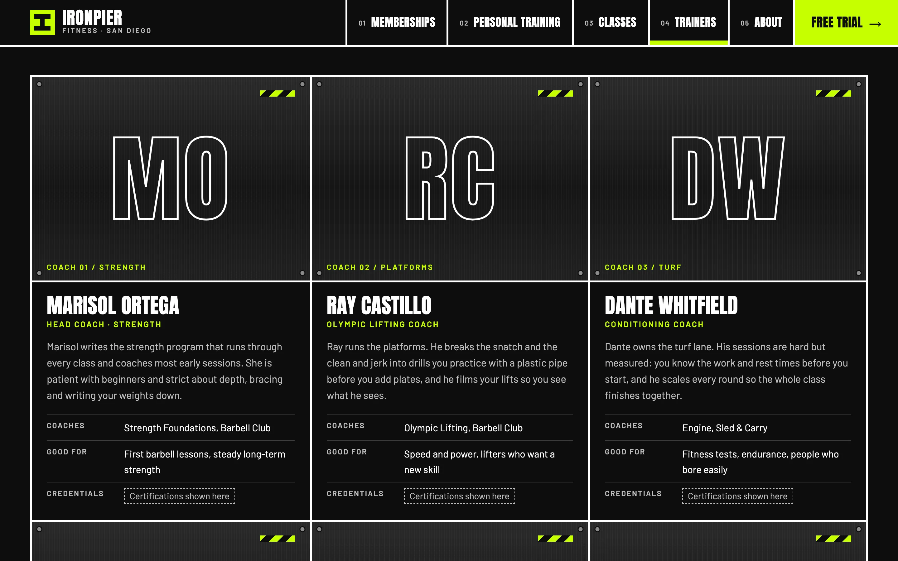
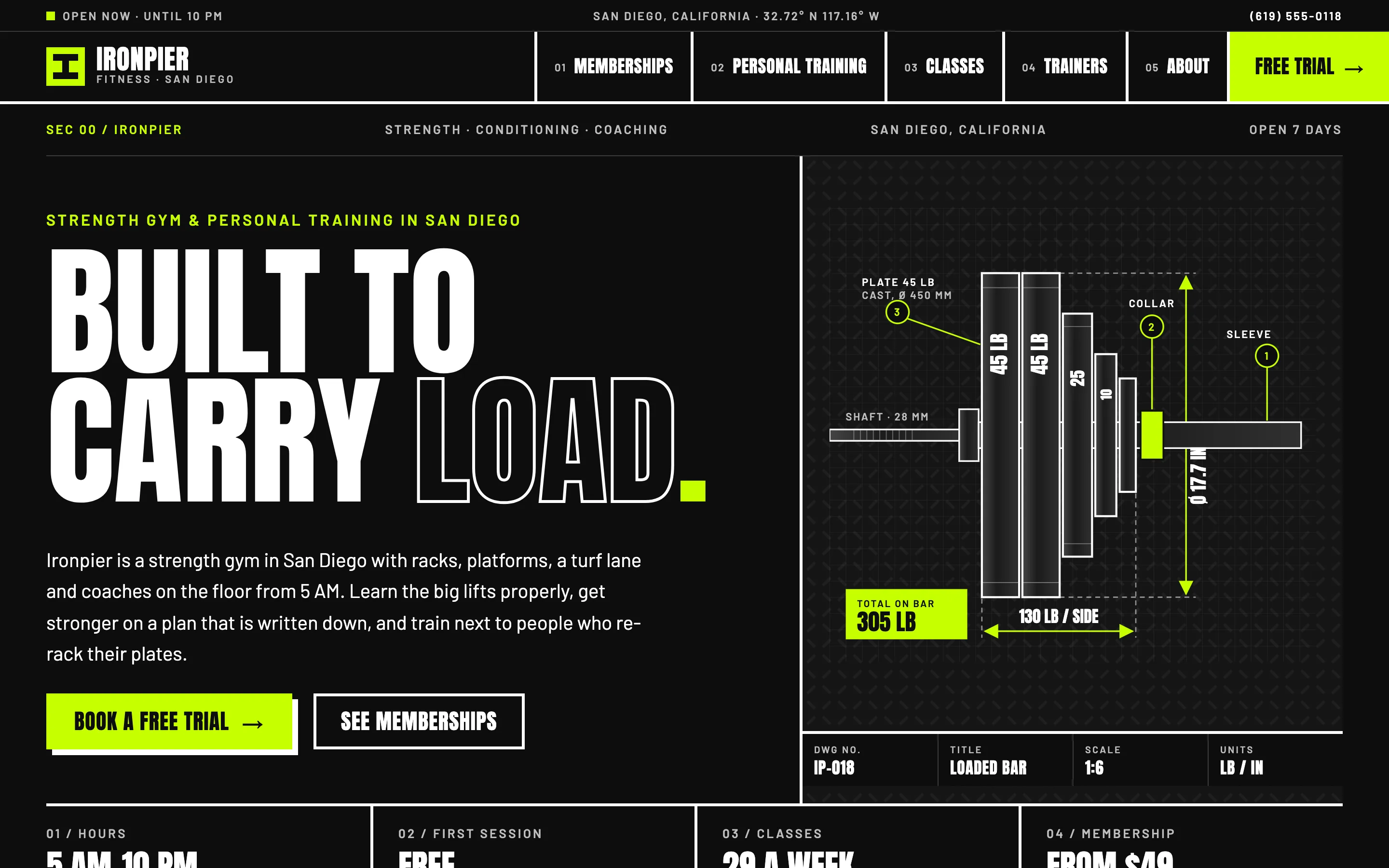
The demo is Ironpier Fitness, a fictional strength gym in San Diego. Its design is industrial on purpose: huge condensed Anton headlines, heavy white rules on black, diamond-plate textures, hazard stripes and a single lime accent, so it looks like the floor of a serious lifting gym rather than a spa. There are no photos at all. The home page leads with a dimensioned technical drawing of a loaded barbell, the floor is shown as an architect's plan, and coaches appear as initials stamped on steel plates.
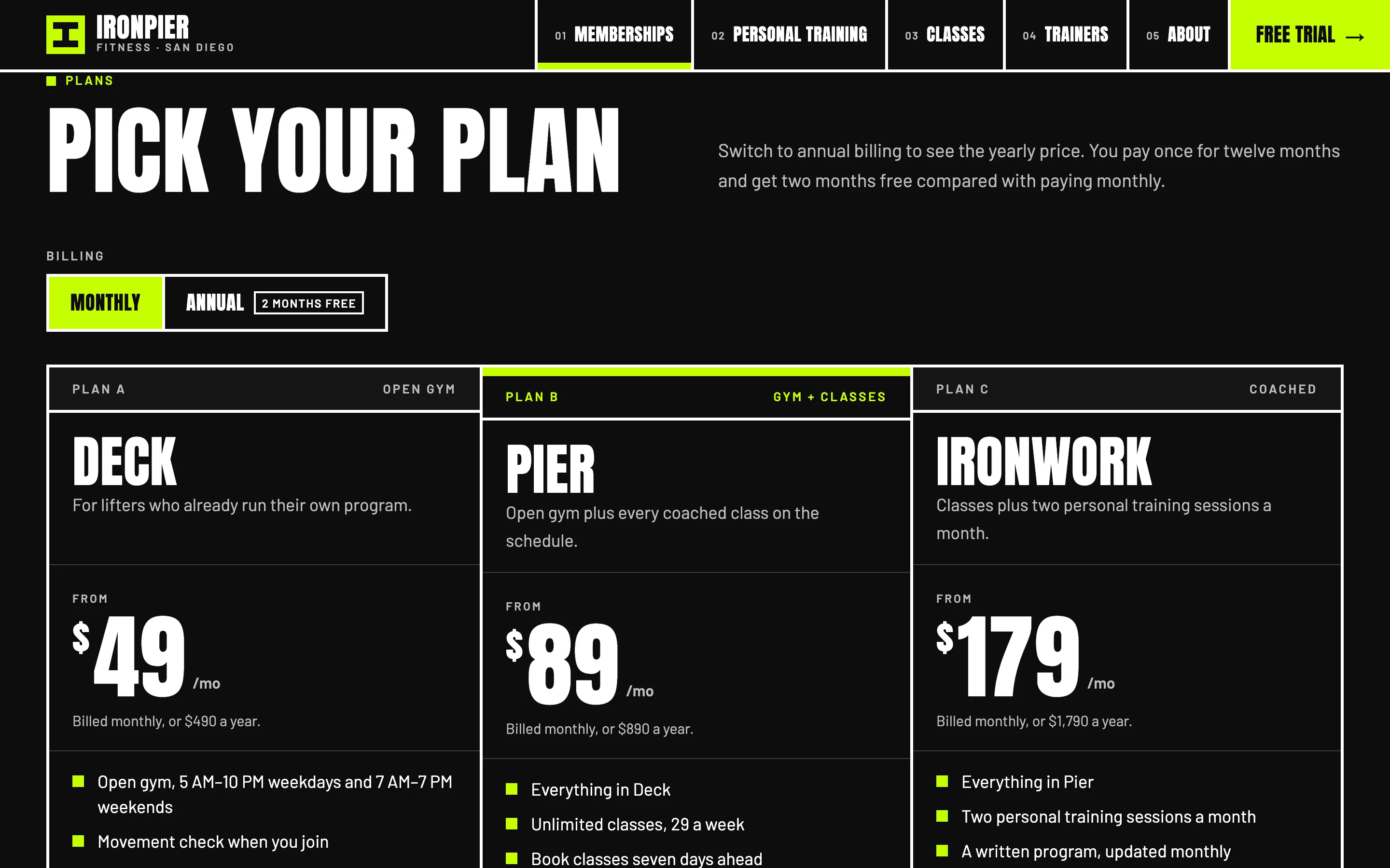
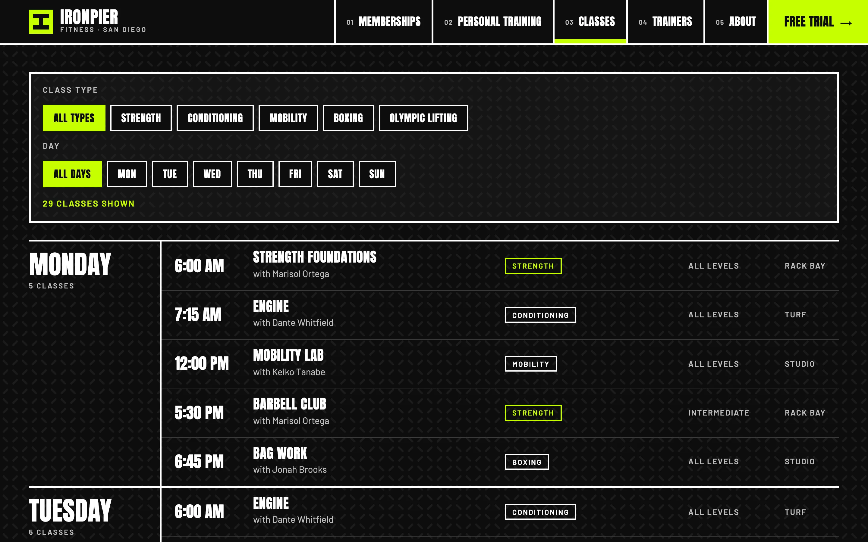
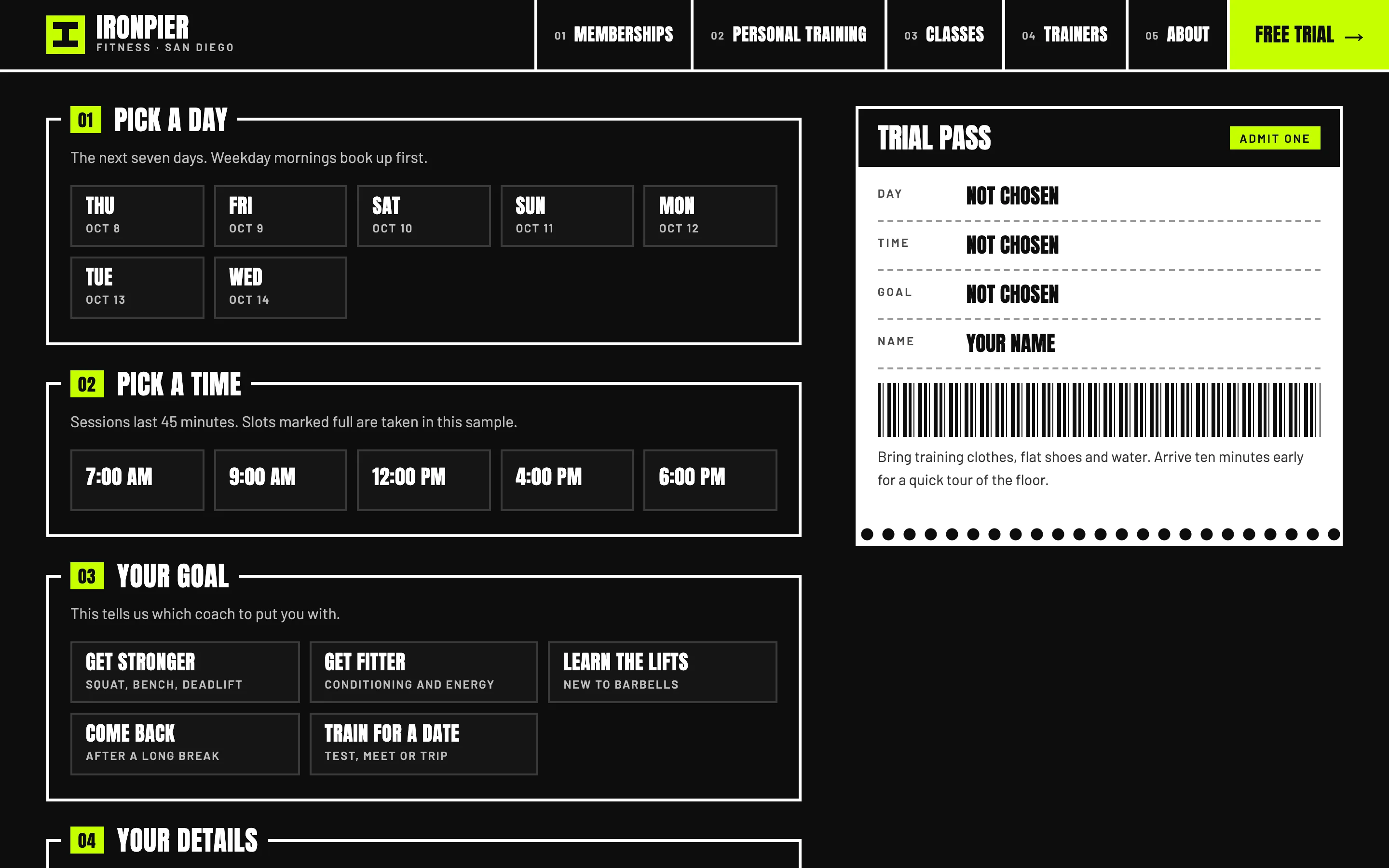
The signature features follow the visitor's three questions. On the memberships page, a monthly or annual switch updates every plan's price and shows the yearly total, and a comparison table lists what each plan includes, down to guest passes, freezes and the notice period for cancelling. On the classes page, the whole week sits on one board that visitors filter by class type and by day, with the coach, level and room on every row; the home page shows today's classes using local San Diego time. The free trial page lets visitors pick a day from the next seven, a time slot, and a goal such as getting stronger or coming back after a break, while a ticket-style trial pass fills in beside the form.
The pages
- Home: the promise, three ways to train, the floor plan and equipment, plan prices, today's classes, the first session in three steps, the coaches, sample reviews clearly labelled as samples, and common questions.
- Memberships: the billing switch, three plans, the comparison table, day passes and class packs, and membership questions.
- Personal Training: who it is for, how the coaching process works from assessment to retest, session formats with sample prices, and questions about injuries and choosing a trainer.
- Classes: what each type of class involves and the filterable weekly schedule.
- Trainers: six coach profiles with their focus, their classes and who they suit, plus how members are matched with a coach.
- Free Trial: the booking form, the live trial pass and what happens in the 45 minutes.
- About: the story behind the name, how the gym coaches, the house rules and the opening hours.
Local SEO set-up for a gym
Every page carries ExerciseGym structured data with the gym's name, logo, area served and opening hours for weekdays and weekends, so search engines read the same hours members see. The memberships page marks each plan as an Offer with its monthly and annual price, personal training and classes are each a Service, and the coaches are listed as people who work for the gym. Inner pages add breadcrumbs, and none of the sample reviews are marked up as ratings.
Titles follow the pattern service, city and gym, such as "Personal Training in San Diego", because people search for "personal trainer near me", "gym membership" or a class type plus their neighbourhood far more often than for a gym's name. The Google Business Profile matters as much as the site: the name, phone, hours, categories and attributes should match exactly, and the profile's website link should go to the free trial page rather than the home page. A gym that draws members from several suburbs can add a short page for each area when it has something real to say about it, such as parking or the nearest transit stop.
Country notes
India
Indian English, prices in rupees as "from" figures, and WhatsApp as the main contact button, because that is how most people in Indian cities ask a gym about timings and fees. Gyms usually sell monthly, quarterly, half-yearly and annual packages, so the billing switch becomes a choice of durations rather than two options. Mention UPI next to cards and cash, leave room for the GSTIN on invoices and in the footer, and show separate batches or ladies-only timings clearly if the gym runs them.
USA
US English, dollars and pounds on the plates. Contract terms deserve as much space as prices: several states regulate health club contracts, and California's automatic renewal law expects members who join online to be able to cancel online, so cancellation and freeze rules belong on the memberships page in plain words. Many older members use fitness benefits from their health plans, so it helps to say which programs the gym accepts. Accessibility matters legally as well as ethically, because fitness businesses receive ADA website claims; the demo's contrast, focus states and labelled form fields are built to WCAG 2.2 AA.
Canada
Canadian English with a French version for gyms serving Quebec. Provinces regulate fitness memberships, with rules on contract length, cooling-off periods and cancellation in places such as Ontario and Quebec, so the terms belong next to the price, not in a PDF. Prices are in Canadian dollars, plates are often still in pounds, and winter is the busiest season for indoor training, which is worth reflecting in the class schedule and the trial offer.
Australia
Australian English, Australian dollars and an ABN placeholder in the footer. Many Australian gyms are open around the clock with key-fob access, so the site should explain staffed hours separately from access hours. State consumer laws and fitness industry codes cover cooling-off periods, direct debits and cancellations, which is a good reason to state the terms clearly. Trainers usually hold a registration with the national fitness industry body, and the demo's credential placeholder is where it goes.
Finland
Finnish and English versions at /fi/ and /, prices in euros written the Finnish way, and a clear note on which employer sport and culture benefits (liikuntaetu) the gym accepts, because many Finnish members pay that way. Round-the-clock access with a key tag is common, so staffed hours and access hours need separate lines. Finns tend to book online rather than call, so the trial form and the schedule filters do more work than the phone number. EU accessibility rules make WCAG 2.2 AA the baseline, and the business ID (Y-tunnus) belongs in the footer.