What shoppers look for on a boutique's website
Someone who finds a boutique on Instagram or walks past the window usually checks the website before they buy. They want to see what is in stock right now, in their size, and roughly what it costs. Then they want to know how it fits, because fit is the reason clothes come back. A boutique site that answers "do you have it in my size, and will it fit me" in two clicks sells; one that shows a pretty gallery with no sizes sends people back to the big retailers.
Small boutiques have an edge the chains do not: a person who has actually worn the piece. A good site puts that knowledge on the page. Fit notes such as "runs big, size down" or "sleeves are long" do more for conversion than another banner, and they cut returns too. Local shoppers also want the practical details: opening hours, whether they can pick up in store, and whether you hem trousers or do small repairs.
How the demo handles it
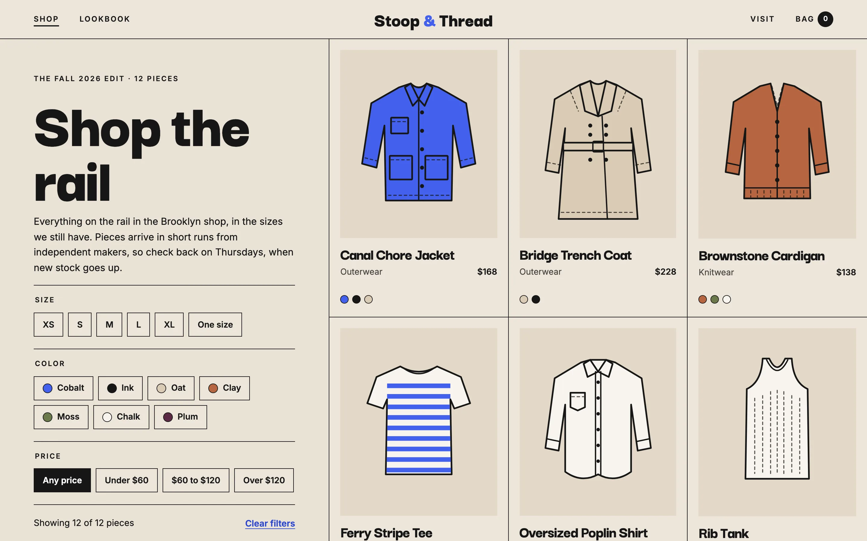
Stoop & Thread is a fictional clothing boutique in Brooklyn, New York. Its twelve sample products live in one simple list, and that list drives the whole store. The shop page shows every piece with its price and colors, and a filter panel narrows the grid by size, color and price as soon as you tap a chip. Sold-out sizes stay visible on the product page but are crossed out, so shoppers know the piece exists and can ask about a restock.
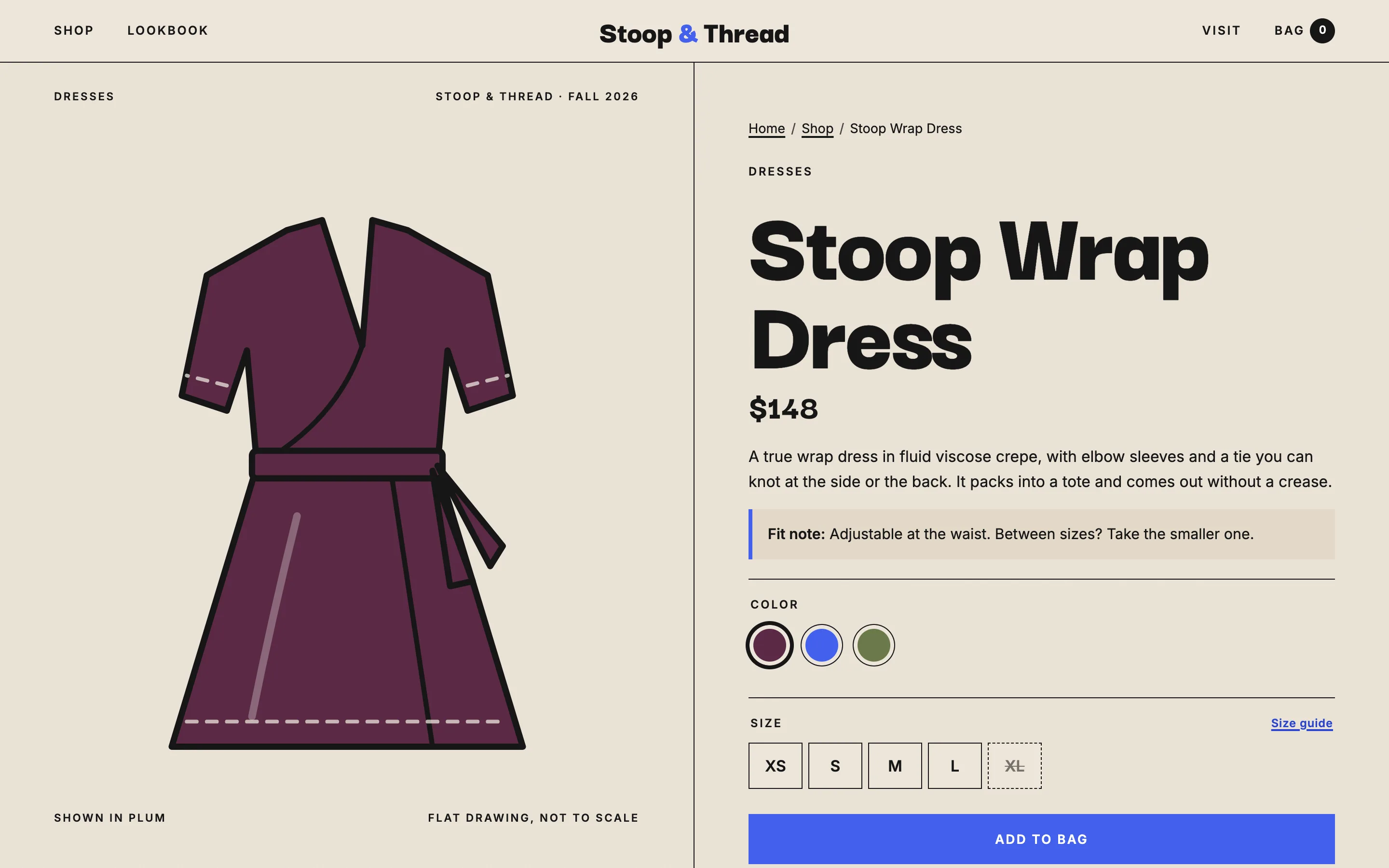
Each product page puts a tall drawing of the garment beside the details. Tapping a color swatch recolors the drawing, which is exactly how photos of each colorway will work on a live site. A fit note from the person who wore it sits above the options, and the size guide opens in a pop-up with chest, waist and hip measurements in inches. Choose a size, tap Add to bag, and a short confirmation links straight to the bag.
The bag remembers what you picked in the browser, so it is still there tomorrow. You can change quantities, remove pieces and switch between US shipping and free pickup in the shop, and the summary shows how far you are from free shipping. Checkout asks only for an email, a name and a ZIP code, then stops at a clearly marked placeholder where the payment provider's own secure page would open. The demo never shows card fields.
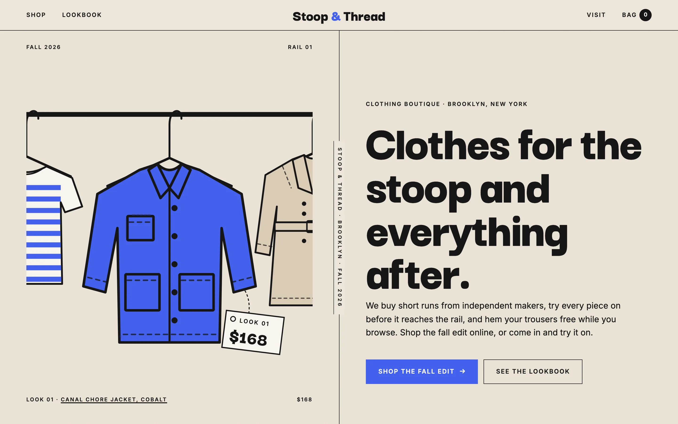
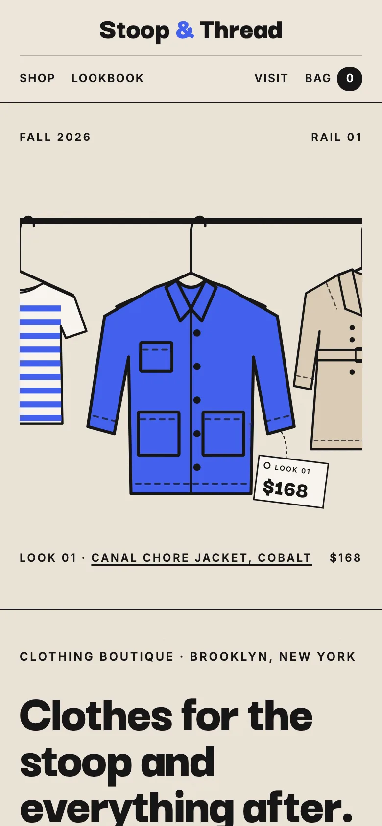
The design is a fashion lookbook in a split screen: tall editorial halves divided by a thin black rule, flat garment drawings with dashed stitching on oatmeal paper, a cobalt accent and tight, heavy headlines. The lookbook page turns four complete outfits into full-height spreads, each with a "shop this look" list that links every piece to its product page.
The pages
- Home: the boutique's promise, new arrivals, how pieces are chosen, a lookbook preview, fit help with a size table, sample reviews, and hours and contact details.
- Shop: all twelve products with filters for size, color and price and a live count.
- Product page: color swatches, sizes with sold-out marked, a size guide pop-up, a fit note, details, and delivery and returns.
- Bag & Checkout: the bag, an order summary with shipping or pickup, and a short checkout that ends at the payment provider placeholder.
- Lookbook: four outfits as editorial spreads, each linked to the shop.
Local SEO set-up for a boutique
The home page targets the search a local shopper types, a clothing boutique in your neighborhood or city, and puts the city in the title, the main heading and the opening paragraph. Product pages carry Product and Offer markup with the price, currency, colors and availability, and the shop page lists every product in an ItemList, which helps search engines show your pieces in shopping results. The business is marked as a ClothingStore with opening hours and the area you serve.
Pair the site with a complete Google Business Profile with the same name, phone number and hours, and post new arrivals there as well as on social media. Real reviews belong on that profile; I never add star ratings or reviews to the site's markup.
Country notes
USA
US English, dollar prices and sizes in US numbers with a guide in inches. Spell out shipping costs, the free-shipping threshold and the returns window, because shoppers compare them. Sales tax is added at checkout by the payment provider, and the site meets WCAG 2.2 AA.
Canada
Canadian English, dollar prices and a size guide in both centimetres and inches. Make clear whether prices include tax and whether you ship across provinces. A boutique in Québec needs a French version first.
Australia
Australian English, dollar prices including GST, and Australian sizes (8, 10, 12) alongside S to XL. Show your ABN as a placeholder until you add it, and mention Afterpay or similar options if you take them, since many shoppers expect them.
India
English by default, with Hindi or a regional language where your customers expect it. Prices in rupees, sizes that include Indian kurta and blouse measurements where relevant, and WhatsApp as the main contact button for questions about fit. UPI and cash on delivery are usually shown at checkout.
Finland
A Finnish version at /fi with English alongside, euro prices in Finnish number format, EU sizes in centimetres, and your Y-tunnus in the footer. Finnish shoppers expect clear returns terms under EU consumer law, and the site meets the EU accessibility rules.