What patients look for on a dental clinic's website
Most people open a dentist's website with a small knot in their stomach. Some have toothache and want the earliest appointment. Some have put off a check-up for years and want to know they will not be judged. Others are comparing clinics for an implant, braces for a teenager or whitening before a wedding, and want to know what the treatment involves and roughly what it costs before they pick up the phone.
A good dental website answers those three visitors without making any of them dig. It says plainly what happens at the first visit, shows the treatments with starting prices, introduces the dentists, and makes booking possible from the first screen, on a phone, at eleven at night. It also has to stay careful: a clinic's website is general information, not a diagnosis, and anything that sounds like a promise of results or a fake review damages trust and can break the rules your dental council sets.
How the demo handles it
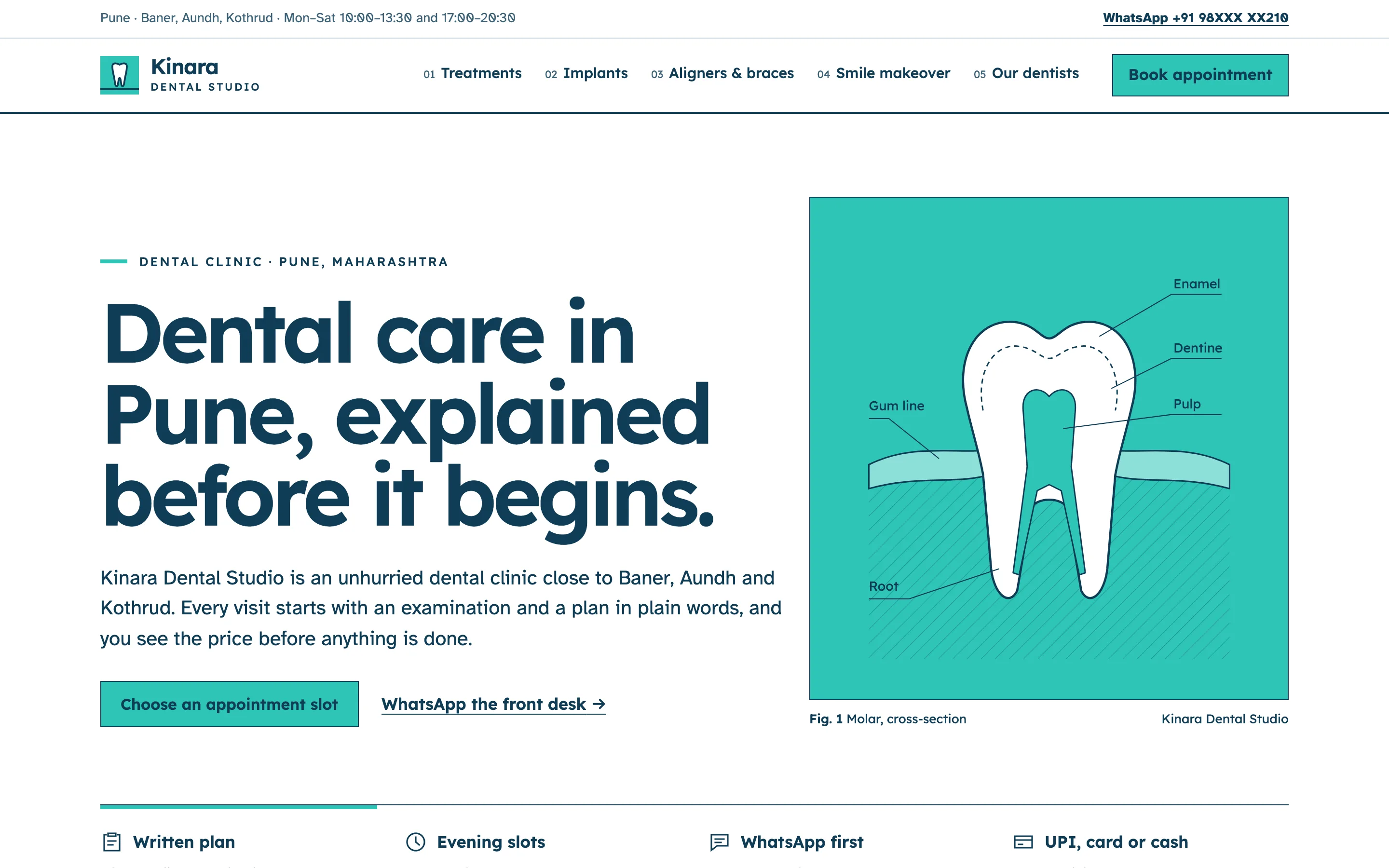
The demo is Kinara Dental Studio, a fictional clinic in Pune. Its design is deliberately calm: white space, a strict grid, one teal accent and Lexend and Atkinson Hyperlegible type, which were both designed for easy reading. Instead of stock photos of smiling models, it uses drawn diagrams: a molar in cross-section on the home page, the parts of an implant, an aligner tray over the upper arch and a shade guide. They explain the treatment and load instantly.
The home page leads with a promise patients care about, that every visit starts with an examination and a written plan and the price is shown before anything is done. Four short facts follow (written plan, evening slots, WhatsApp first, payment options), then the first visit in three steps, a treatment table with starting prices, the dentists, sample reviews clearly labelled as samples, and the opening hours.
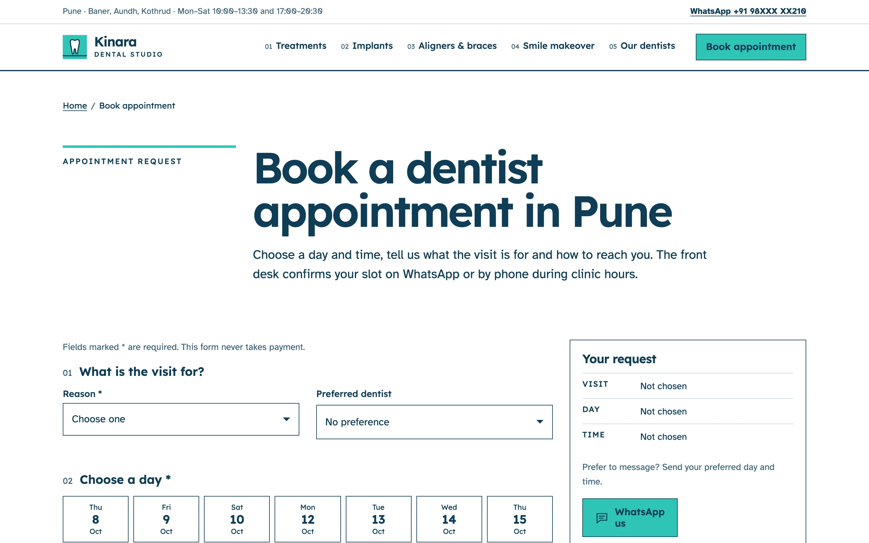
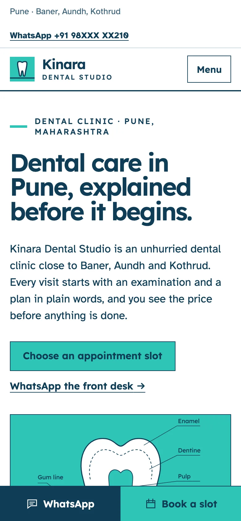
Booking is the signature feature. The appointment page has a slot picker: the next seven opening days, morning and evening times, and slots that are already full shown as dashed and disabled. Visitors choose the reason for the visit and, if they like, a dentist, then leave a name and mobile number. A summary panel shows the request as they build it, and the form checks the number before it sends. Every treatment page links to the booking page with that treatment already chosen. On phones a bar at the bottom of the screen keeps WhatsApp and Book a slot one tap away.
The pages
- Home: the first-visit promise, how a first appointment works, selected treatments with from prices, the team, sample reviews, hours and area.
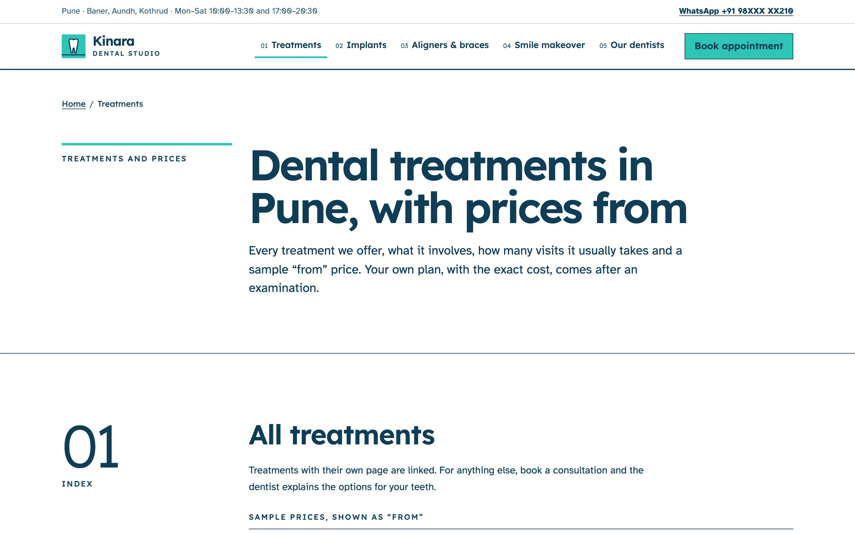
- Treatments: every treatment grouped as everyday care, restorative, orthodontic, cosmetic and children, with what it involves, typical visits and a from price, plus how pricing, payment and second opinions work.
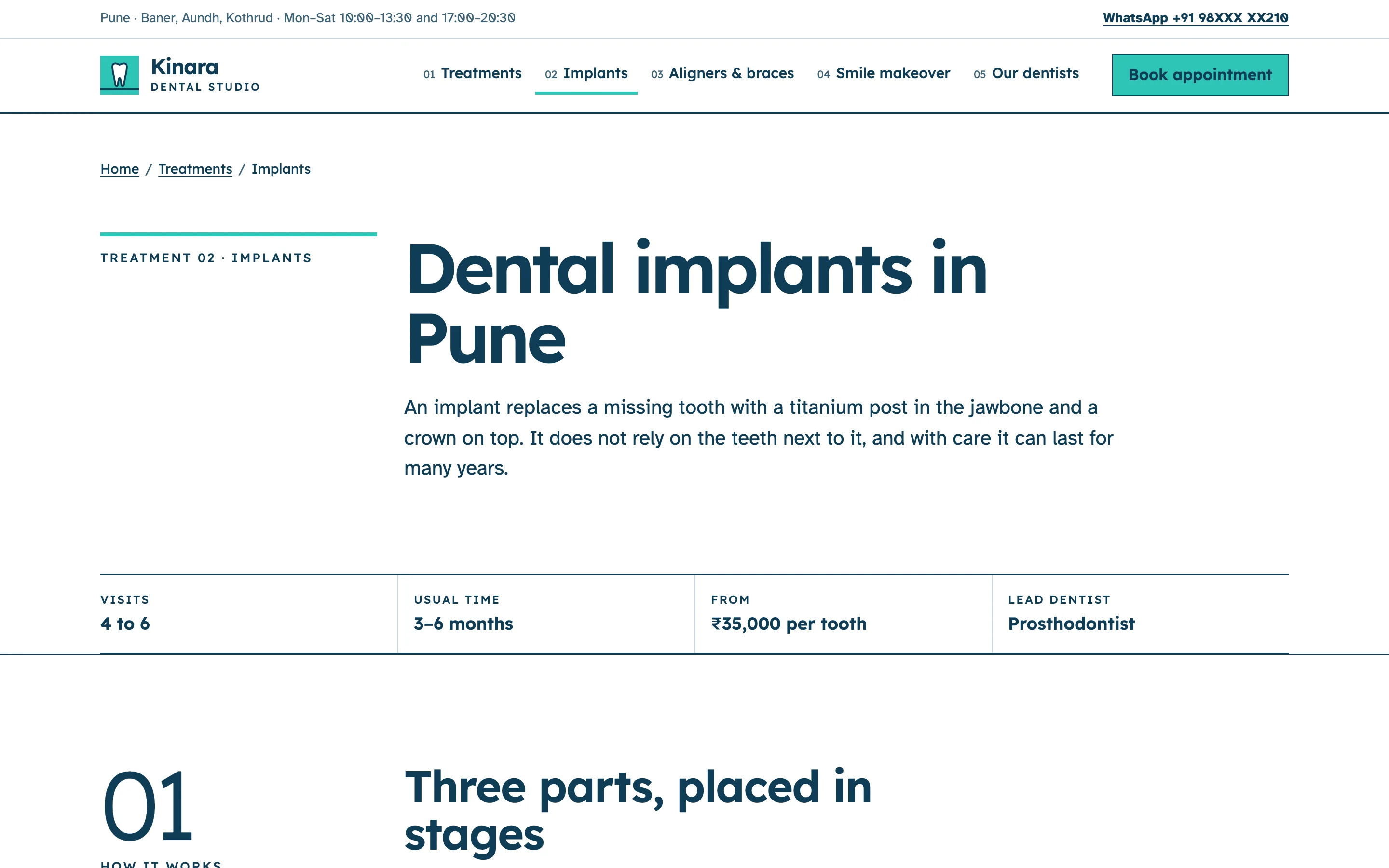
- Implants, Aligners & Braces and Smile Makeover: a page each with an at-a-glance strip (visits, usual time, from price, lead dentist), the stages from consultation to result, a drawn diagram, who the treatment suits, a general-information note and four or five FAQs.
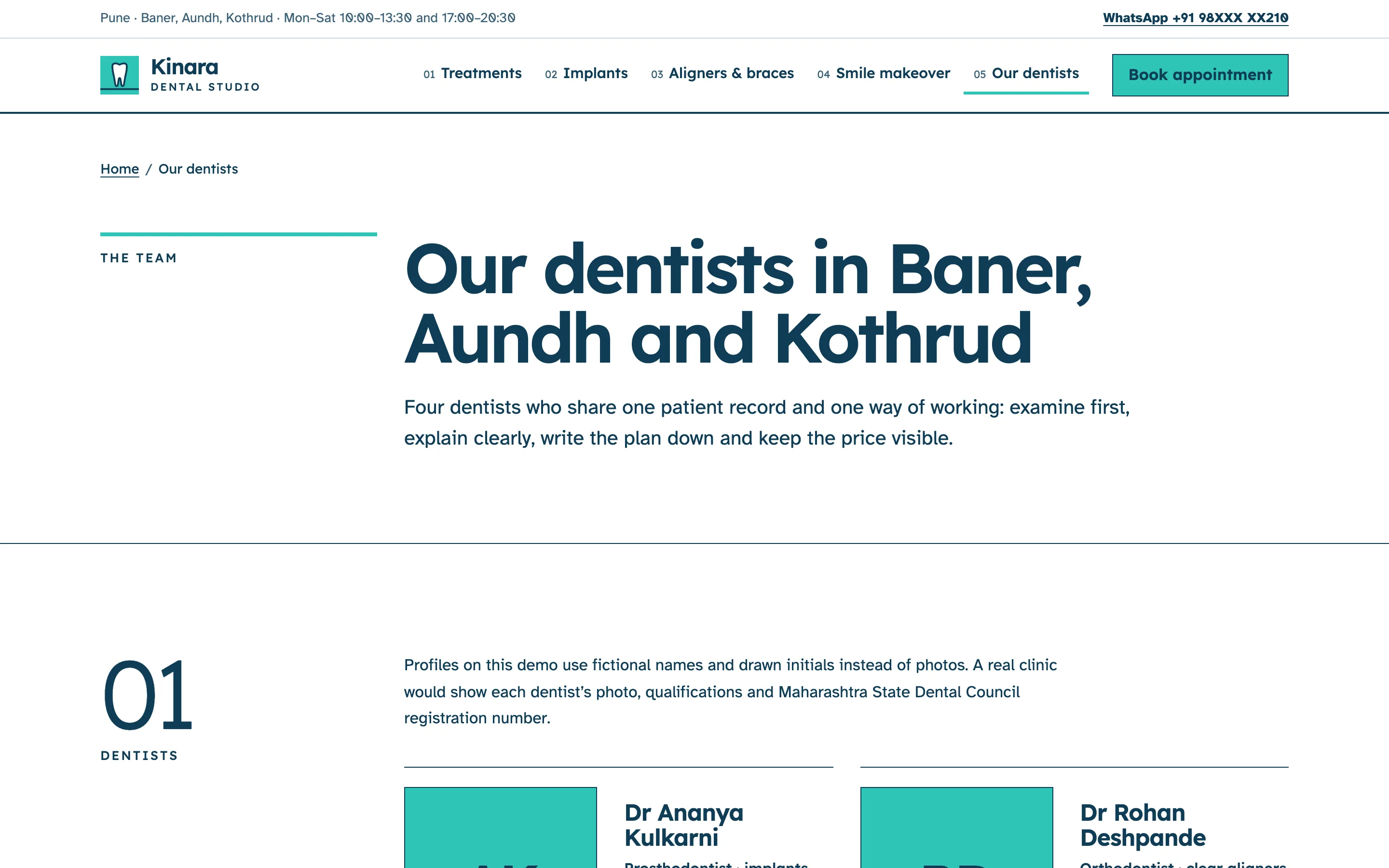
- Our Dentists: four profiles with focus areas and a marked place for qualifications and registration numbers, and how the team shares one plan and one record.
- Book Appointment: the slot picker and form, what happens after a request, and when to go to a hospital instead.
Local SEO set-up for a dental clinic
Every page carries Dentist structured data with the clinic's name, logo, area served, payment options and both daily opening sessions, so search engines read the same hours patients see. Treatment pages add a Service with a starting price and an FAQPage built from the questions on the page; inner pages add breadcrumbs. Titles follow the pattern treatment, city and clinic name, such as "Dental Implants in Pune", and each page has its own description written to be clicked.
For a clinic that draws patients from several neighbourhoods, the areas are named in the copy and in the schema, and a real launch can add a short page per area when the clinic has something specific to say about it. The website and the Google Business Profile should match exactly: name, phone, hours, categories and the treatment list. I set the profile's website and appointment links to the matching pages, so a patient who finds you on the map lands on the booking form, not the home page.
Country notes
India
Indian English, prices in rupees shown as "from", and WhatsApp as the main contact button, because that is how most patients in Indian cities prefer to book and ask questions. Mention UPI next to cards and cash. Show the clinic's and each dentist's State Dental Council registration numbers, and leave room for a GSTIN. Evening sessions matter in cities where patients work office hours, and many older patients are booked by a son or daughter, so the copy speaks to families too.
USA
US English, dollars, and a booking flow that asks about dental insurance and whether the patient is new or existing. Practices commonly list the PPO plans they accept and explain membership plans for patients without insurance. Accessibility matters legally as well as ethically, because dental practices receive ADA website claims; the demo's contrast, focus states and labelled form fields are built to WCAG 2.2 AA. Avoid any wording that could read as a guarantee of results.
Canada
Canadian English with the option of French, which is required for a clinic serving patients in Quebec. Many patients ask whether a clinic bills their insurer directly, so that belongs near the booking button, along with a line about the Canadian Dental Care Plan for eligible patients. Provincial regulators have advertising rules about testimonials and comparative claims, so reviews are handled carefully, and the dentist's licence is shown as the regulator lists it.
Australia
Australian English, dollars and a clear line on private health funds: whether the clinic is a preferred provider for any fund and whether HICAPS claiming happens on the spot. AHPRA's advertising rules restrict testimonials about clinical care and anything that creates unreasonable expectations, which suits the demo's general-information approach. Show each practitioner's AHPRA registration number and the practice's ABN placeholder in the footer.
Finland
Finnish and English versions at /fi/ and /, prices in euros written the Finnish way (85 €), and notes on Kela reimbursement and public versus private dental care, because patients compare a private clinic with the municipal dental service. Finns tend to book online rather than call, so the slot picker does more work than the phone number. EU accessibility rules make WCAG 2.2 AA the baseline, and the business ID (Y-tunnus) belongs in the footer.