What patients look for on a physiotherapy website
People rarely arrive at a physio's website feeling patient. Their back seized up when they bent to pick up a bag, their knee has ached through three running seasons, or a surgeon has just said "you'll need physio after this". They want to know three things quickly: do you treat my problem, when can I be seen, and what will it cost me after my insurance. Most clinic websites answer none of them on the first screen. They open with a stock photo of a smiling patient on a treatment table and a list of techniques the visitor has never heard of.
A good physiotherapy website works the other way round. It starts from the visitor's pain, uses their words ("pain on the side of the hip at night", not "greater trochanteric pain syndrome"), shows who in the team knows that problem best, and puts an open appointment in front of them within a couple of taps. It also stays careful. A clinic's website is general information, not a diagnosis, and anything that sounds like a guaranteed result, or a review that cannot be traced to a real patient, costs trust and can break the rules your health regulator sets.
How the demo handles it
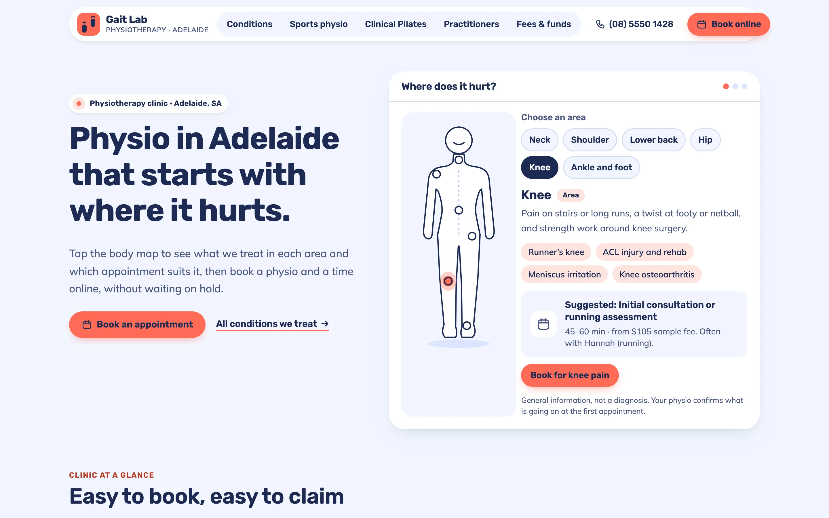
The demo is Gait Lab Physiotherapy, a fictional clinic in Adelaide, South Australia. It is designed like a friendly app rather than a brochure: a pale blue background, white cards with soft shadows, coral as the one strong colour, and Rubik and Mulish type, which stay readable at small sizes on a phone.
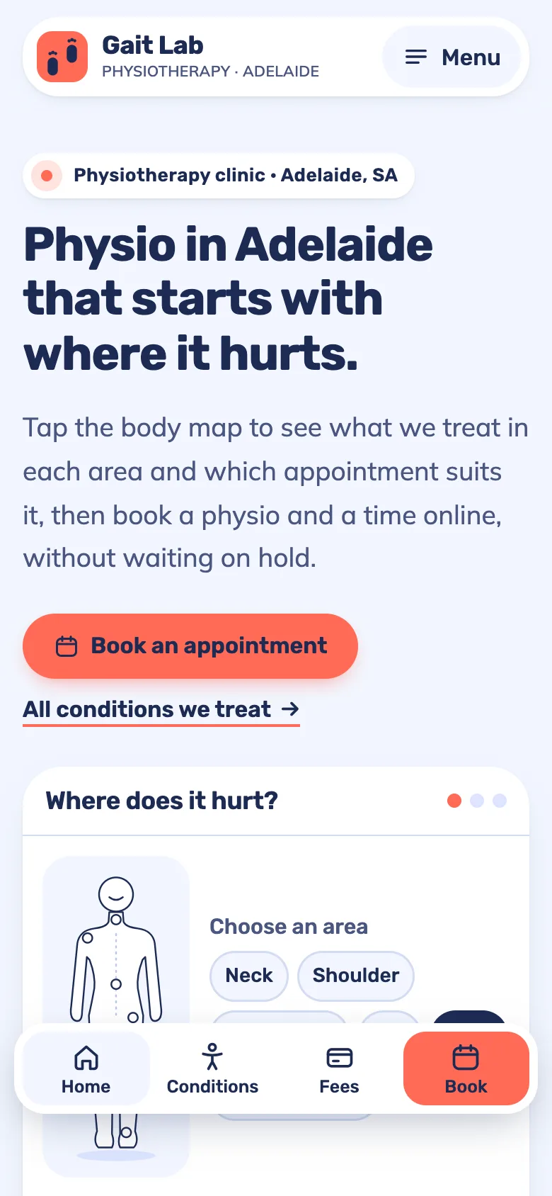
The home page opens with the signature feature, a body map. Visitors tap the neck, shoulder, lower back, hip, knee or ankle (on the drawing or on a row of buttons), and a card shows the conditions the clinic often sees in that area, the appointment that usually suits it, which physio tends to see it and a button to book. The button opens the booking page with the right appointment type already chosen and the area noted. Without JavaScript, all six areas simply show as a list, so nothing is hidden. A small line under the map says it is general information and that the physio confirms what is going on at the first visit.
Below the map, a row of dashboard-style tiles answers the questions people usually ring to ask: the next free time, opening hours, how long the first visit takes and whether they can claim on the spot. Then come the first appointment in four steps, the three services, the team, fees, sample reviews clearly labelled as samples, and the hours.
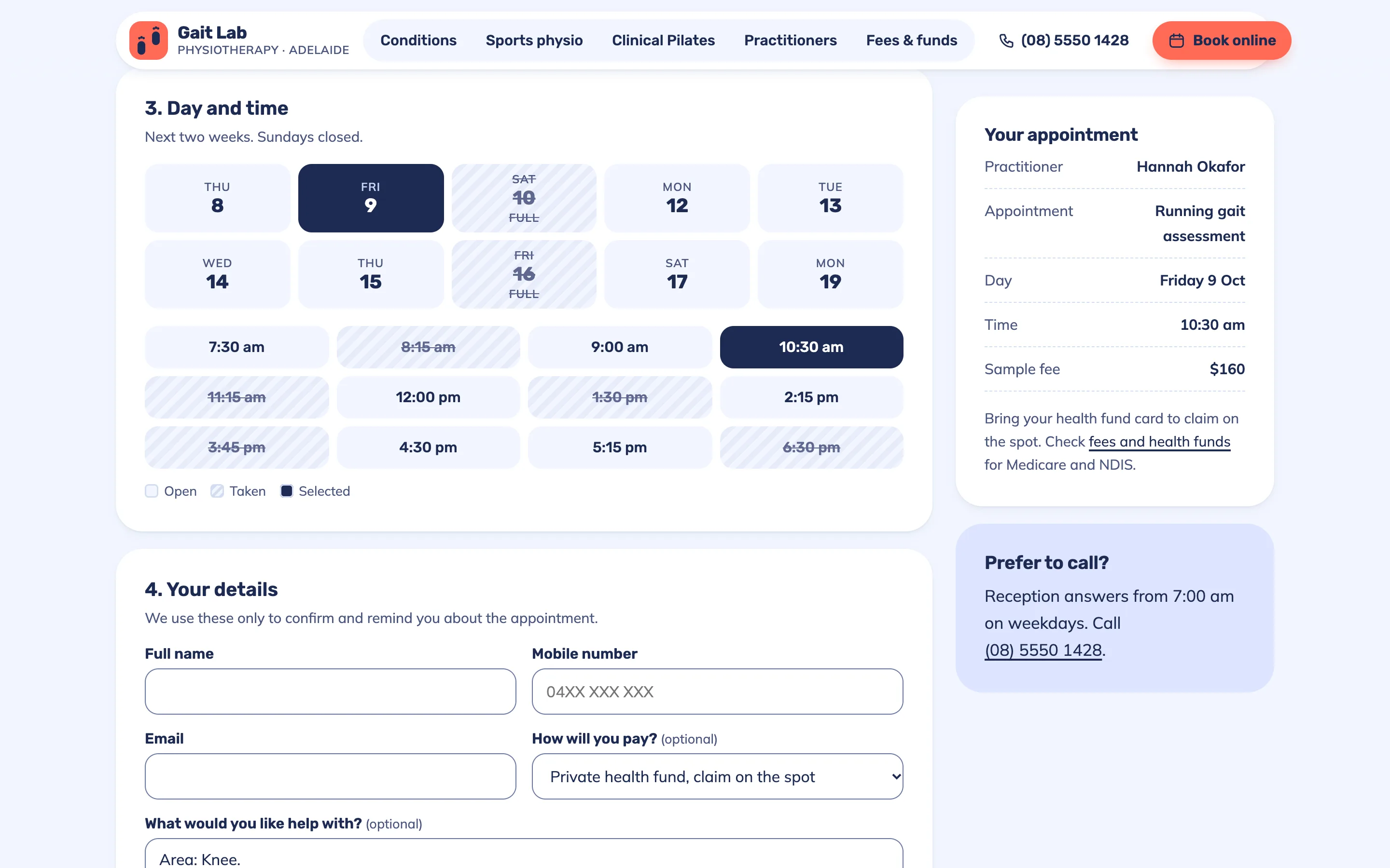
Booking is the second signature feature. Patients choose a practitioner or "first available", an appointment type with its fee, a day from the next two weeks and an open time; taken times are struck through and fully booked days are marked. A progress bar fills as they go, and a summary panel shows the appointment as they build it. The form checks the name, phone number and email before it confirms, and moves the keyboard focus to the first thing that needs fixing. On phones a floating tab bar keeps Book one tap away and moves up so it never hides behind other bars.
The pages
- Home: the body map, clinic tiles, the first visit in four steps, services, practitioners, a fees snapshot, sample reviews, hours and when to go to an emergency department instead.
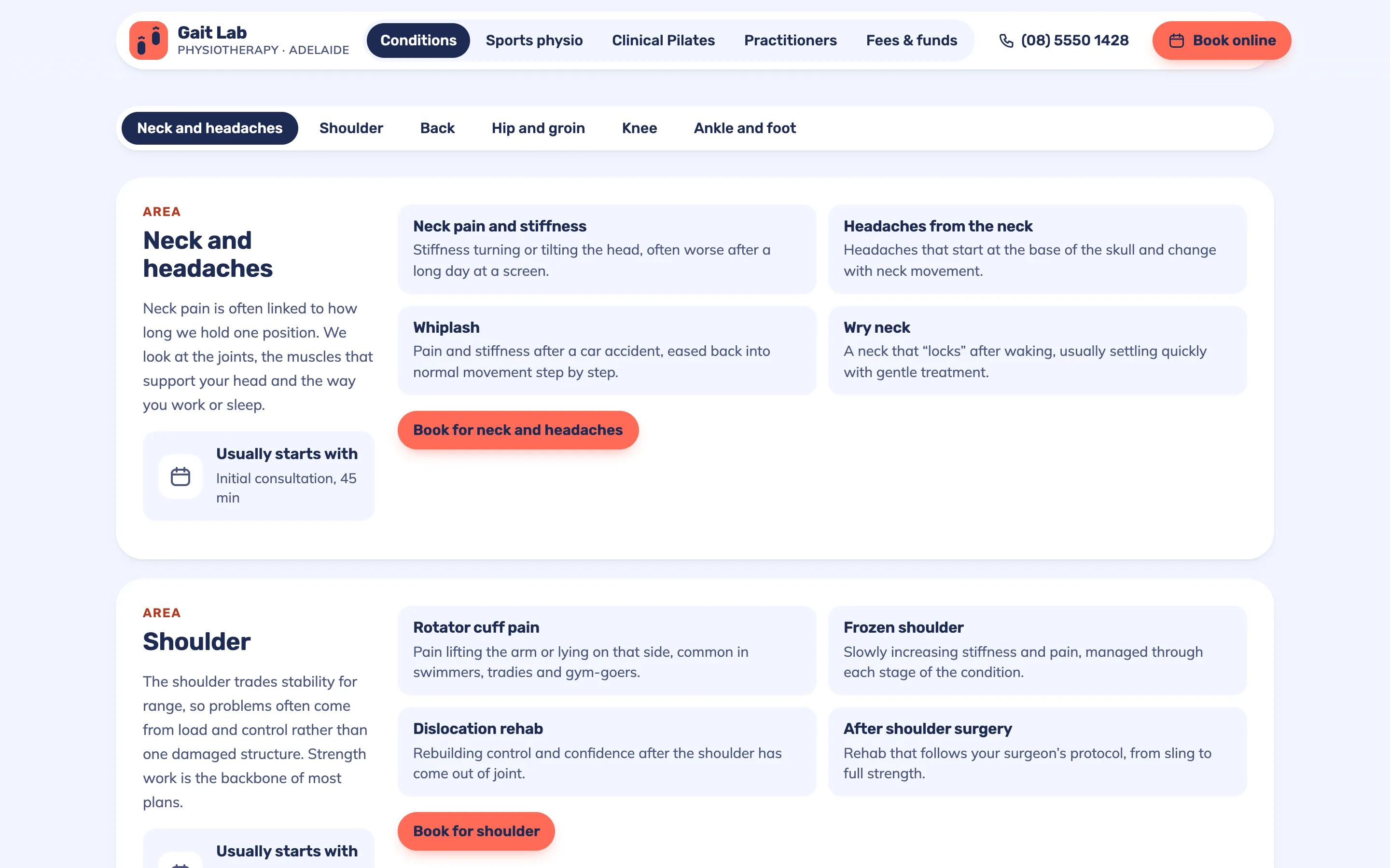
- Conditions We Treat: six body areas with sticky tabs, four common conditions each in plain words, the usual first appointment and a note on when to see a doctor first.
- Sports Physio: a staged return-to-sport ladder, the running gait assessment the clinic is named after, and support for clubs.
- Clinical Pilates: how people move from assessment to small classes, a weekly timetable with places left, fees and questions.
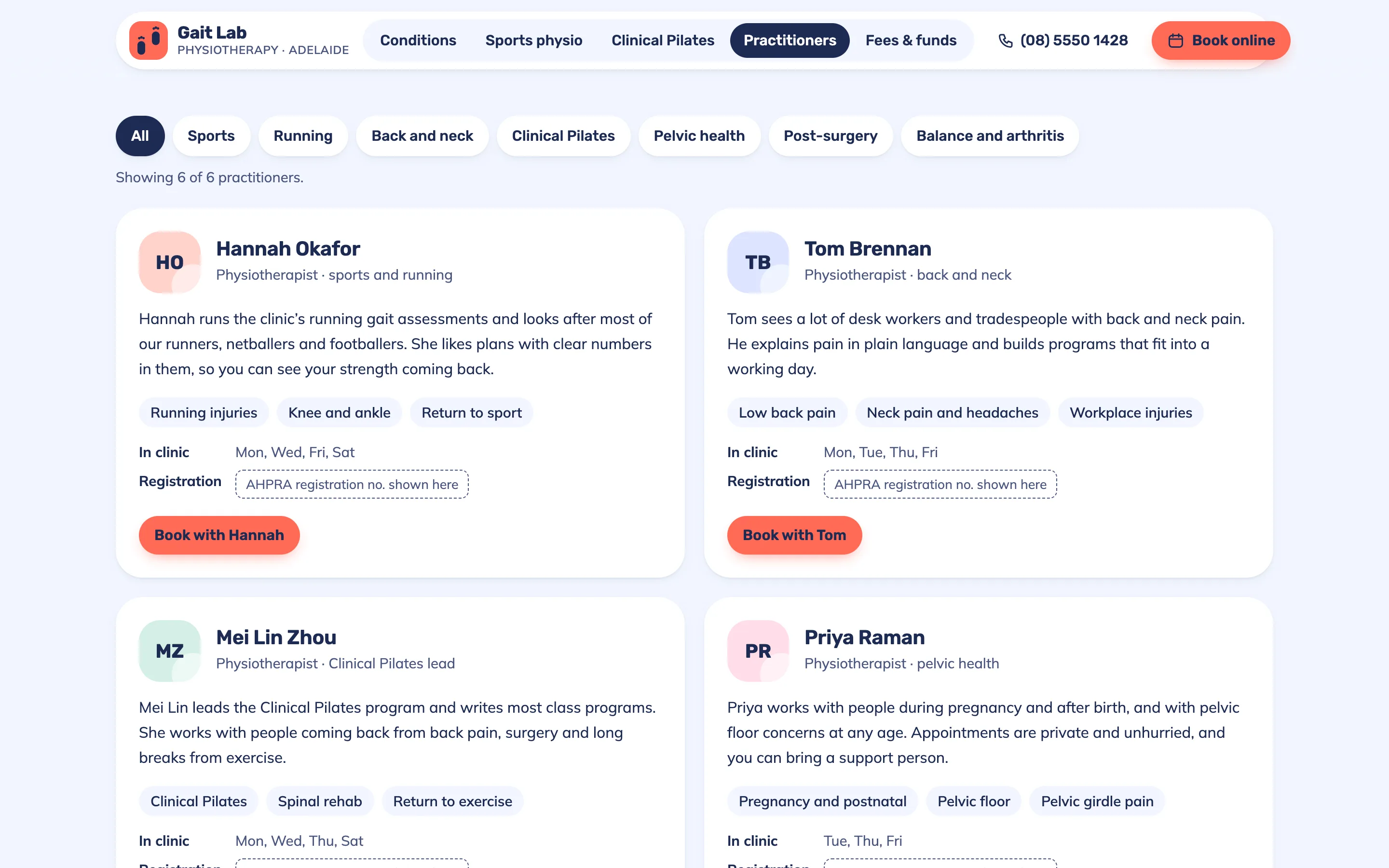
- Practitioners: six profiles with a speciality filter, days in clinic and a placeholder for each registration number.
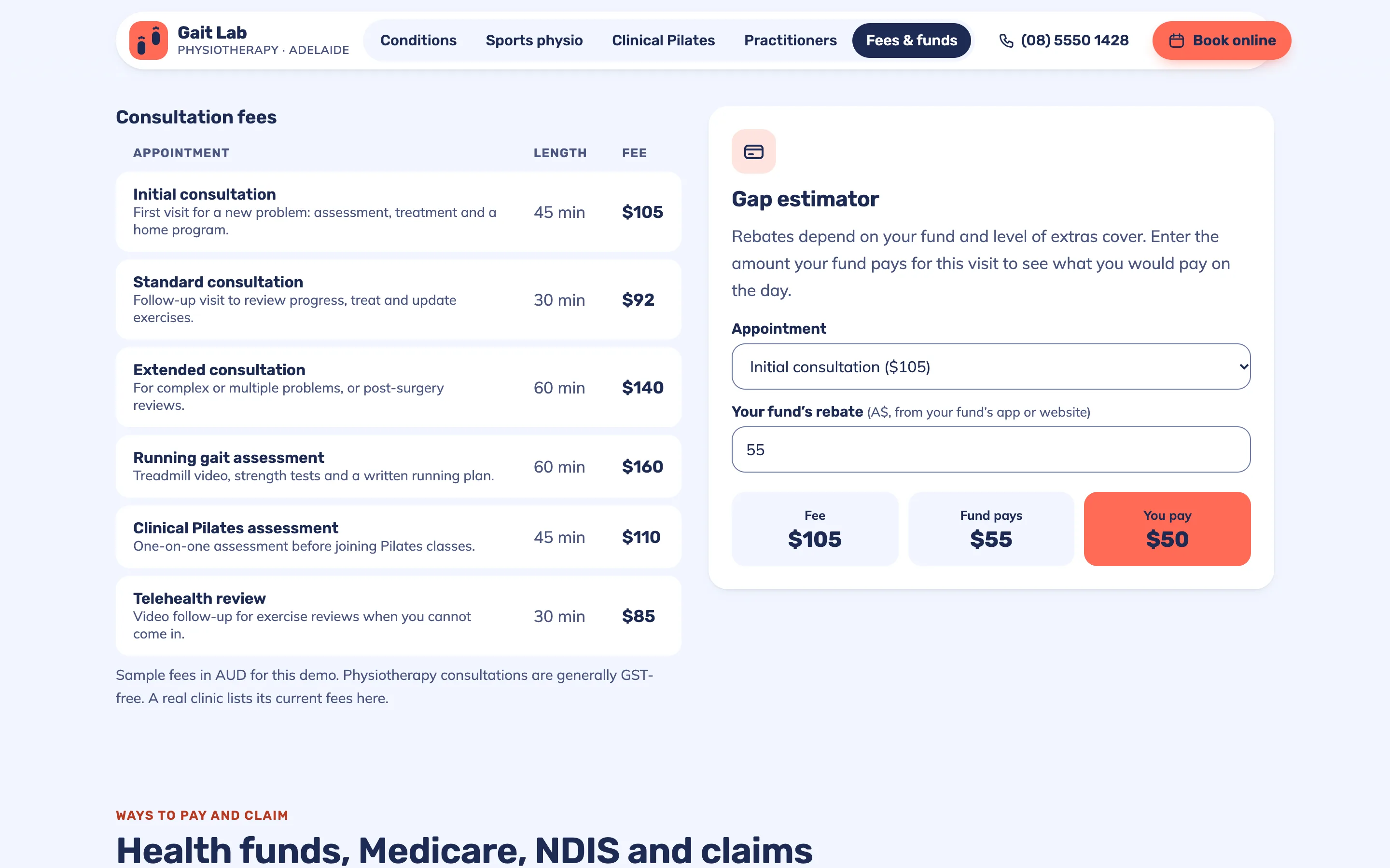
- Fees & Health Funds: a fee table, a gap estimator, and general notes on insurance, government schemes and injury claims.
- Book: the appointment calendar and form, ending on a confirmation screen.
Local SEO set-up for a physiotherapy clinic
Every page carries Physiotherapy structured data with the clinic's name, logo, area served, payment options and opening hours, so search engines read the same details patients see. Service pages add a Service node, the fees and Pilates pages list their prices as offers, and every inner page has breadcrumbs. Titles follow the pattern service, city and clinic, such as "Sports Physio and Running Assessment in Adelaide", and each page has its own description.
For a clinic that draws from several suburbs or a second location, each location gets its own page with its own hours and team. The website and the Google Business Profile should match exactly, and I point the profile's appointment link at the booking page, so someone who finds you on the map lands one tap from an open time.
Country notes
India
Indian English, fees in rupees, and WhatsApp as the main contact button, with UPI listed beside cards and cash. Home-visit physiotherapy is common in Indian cities, especially for older patients after surgery, so a home-visit request with the patient's area belongs next to the clinic booking. Families often book for a parent, and the copy speaks to them. Show each physio's registration or membership details where they apply, and leave room for a GSTIN in the footer.
USA
US English and the American term: the site says "physical therapy" and "physical therapist", which is what people search for. Booking asks about insurance, and the fees page explains self-pay rates, because many patients compare what their plan covers. Rules on seeing a physical therapist without a referral vary by state, so the copy states your state's position plainly. Accessibility matters legally as well as ethically, and the demo's contrast, focus states and labelled fields are built to WCAG 2.2 AA.
Canada
Canadian English, with a French version for clinics serving Quebec. Patients ask whether the clinic bills their extended health insurer directly and whether a doctor's referral is needed for their plan, so both answers sit near the booking button. Motor vehicle accident and workplace injury claims are a large share of many clinics' work and get their own short section. Show each physiotherapist's registration with the provincial regulator.
Australia
Australian English and the details patients check first: private health fund rebates claimed on the spot, Medicare rebates through a GP care plan, NDIS, and work injury and motor vehicle claims, each explained as general information. Show every practitioner's AHPRA registration number and the ABN in the footer. AHPRA's advertising guidelines restrict testimonials about clinical care and claims that create unreasonable expectations, and "specialist" should only describe physios who hold that title through the Australian College of Physiotherapists.
Finland
Finnish and English versions at /fi/ and /, fees in euros written the Finnish way, and notes on when a doctor's referral, Kela reimbursement or occupational health care (työterveys) applies, because many working patients reach a physio through their employer. Finns tend to book online rather than call, so the calendar does more work than the phone number. Show that physiotherapists are licensed professionals listed in Valvira's register, put the Y-tunnus in the footer, and treat WCAG 2.2 AA as the baseline under EU accessibility rules.