What patients want from a lab website
Nobody visits a diagnostic lab's website to browse. They arrive with a prescription in one hand and a phone in the other, and they want three answers: do you do this test, what does it cost, and what do I have to do before the sample. A fourth question follows close behind in most Indian cities: can someone come home to collect it, and how early.
Many lab websites bury those answers. The test list is a PDF, the prices are "call for details", and fasting rules appear only in the confirmation SMS, which arrives after the patient has eaten breakfast. The result is a phone line that rings all morning with the same questions, and patients who give up and book with the lab whose app showed the price first.
A good lab website answers the prescription. It lets someone type exactly what the doctor wrote, even if that is "LFT" or "sugar fasting and PP", shows the test with its sample type, preparation and report time, and adds it to a list they can book in one go. It also has to stay honest: a lab runs tests, it does not tell people which tests they need or what a result means.
How the demo handles it
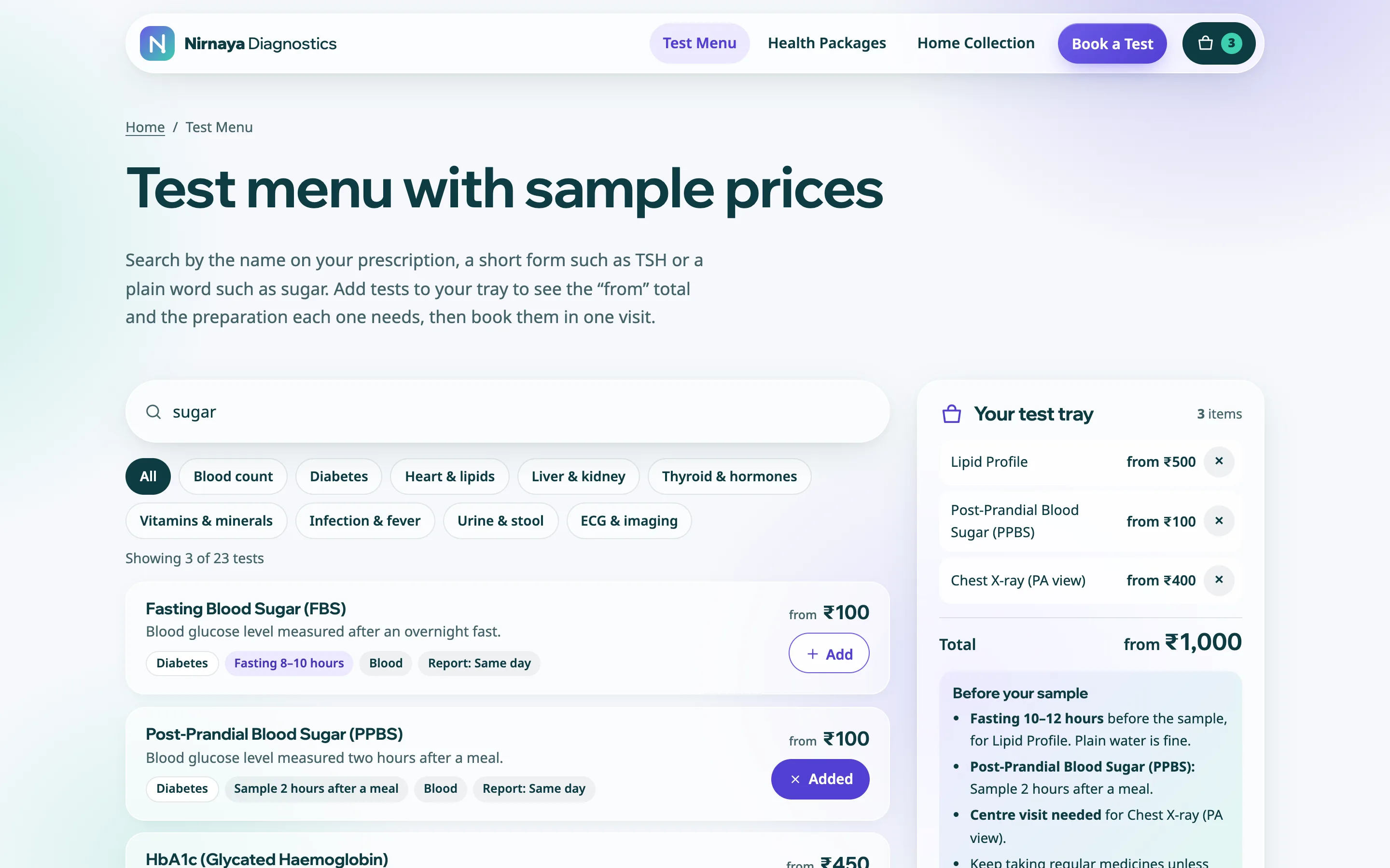
Nirnaya Diagnostics is a fictional lab in Chennai. Its test menu lists around two dozen common tests, from a complete blood count and HbA1c to thyroid profiles, vitamin D, ECG and ultrasound. The search box matches full names, short forms and everyday words, so "thyroid", "TSH" and "T3" all find the right rows, and category chips narrow the list to diabetes, liver and kidney, vitamins or imaging.
Each test has an Add button. Added tests collect in a tray that stays with the visitor as they move between pages. The tray shows a running "from" total and, more usefully, works out the preparation: the longest fasting period across the chosen tests and which tests need it, a note when a post-meal sample is needed, and a warning when something such as an X-ray can only be done at the centre. Patients see this before they book, not after.
Health packages use the same tray. Every package lists every test inside it, with the fasting note for the whole package, so a patient can compare it with their prescription instead of guessing what "full body check" means.
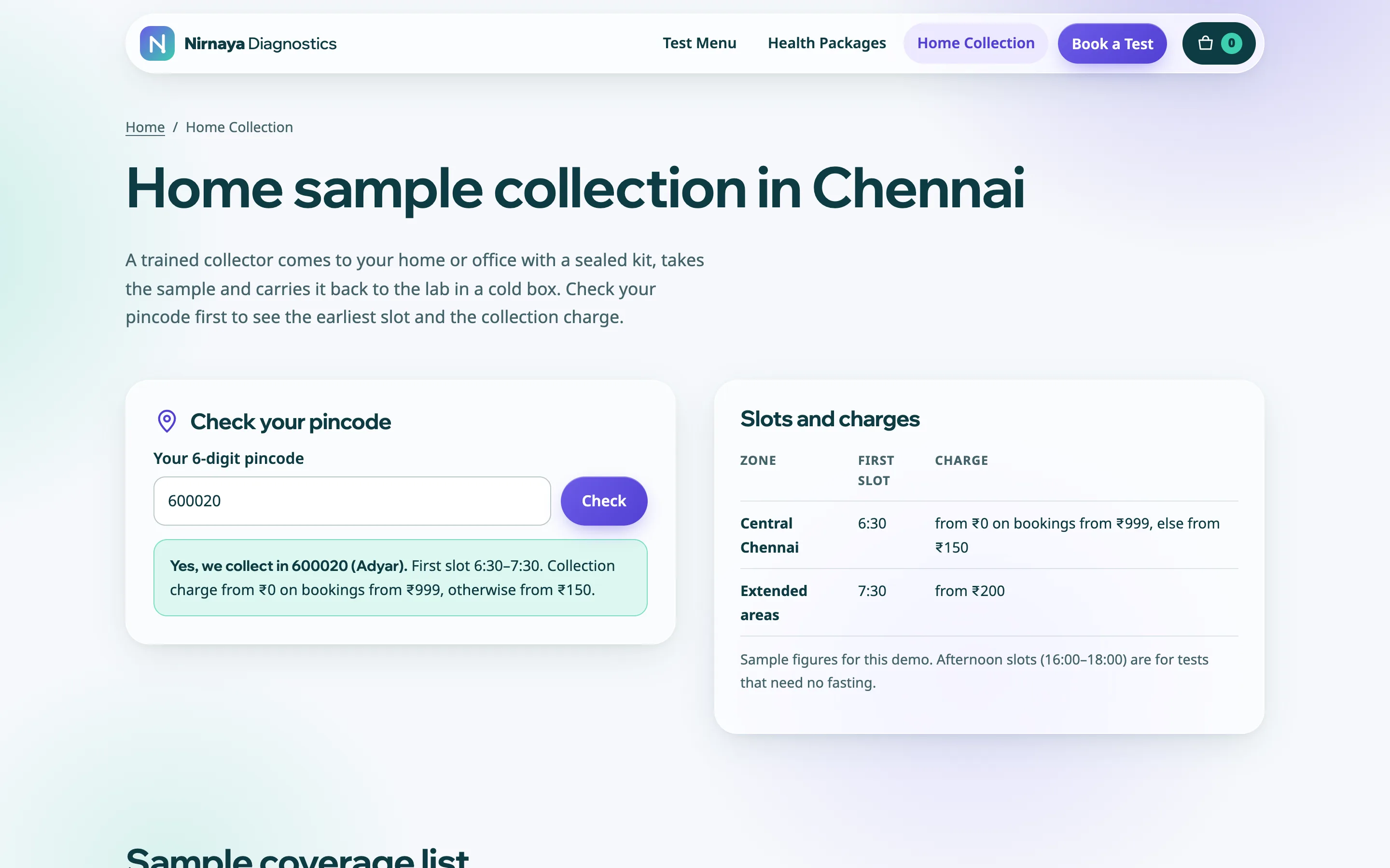
The home collection page has a pincode check. A visitor types their pincode and learns whether a collector covers it, the earliest morning slot and the collection charge for that zone, or is offered a centre visit or a WhatsApp chat if the area is not covered. The same check runs inside the booking form.
The booking form brings in the tray, accepts a prescription photo for anyone who would rather not type, and asks for collection type, pincode, date, slot and patient details. Booking for a parent is a common case, so the form separates the patient's name and age from the contact mobile number.
Pages
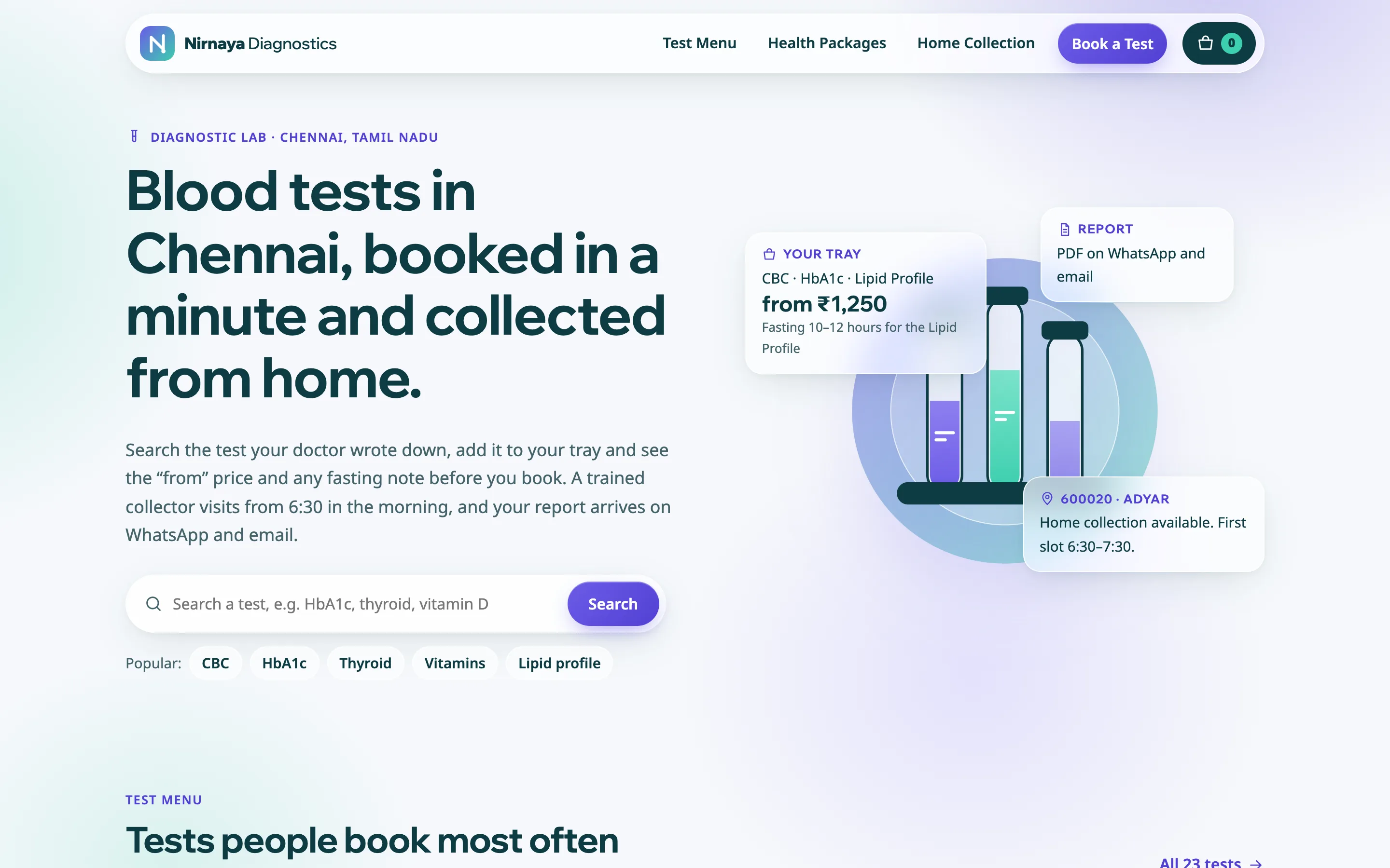
The demo has five pages: Home, Test Menu, Health Packages, Home Collection and Book a Test. Home leads with search and the most booked tests, then packages, the four steps of home collection, how samples are handled and the opening hours. Accreditation and registration numbers sit in the footer as labelled placeholders, and every page reminds patients to discuss reports with their doctor.
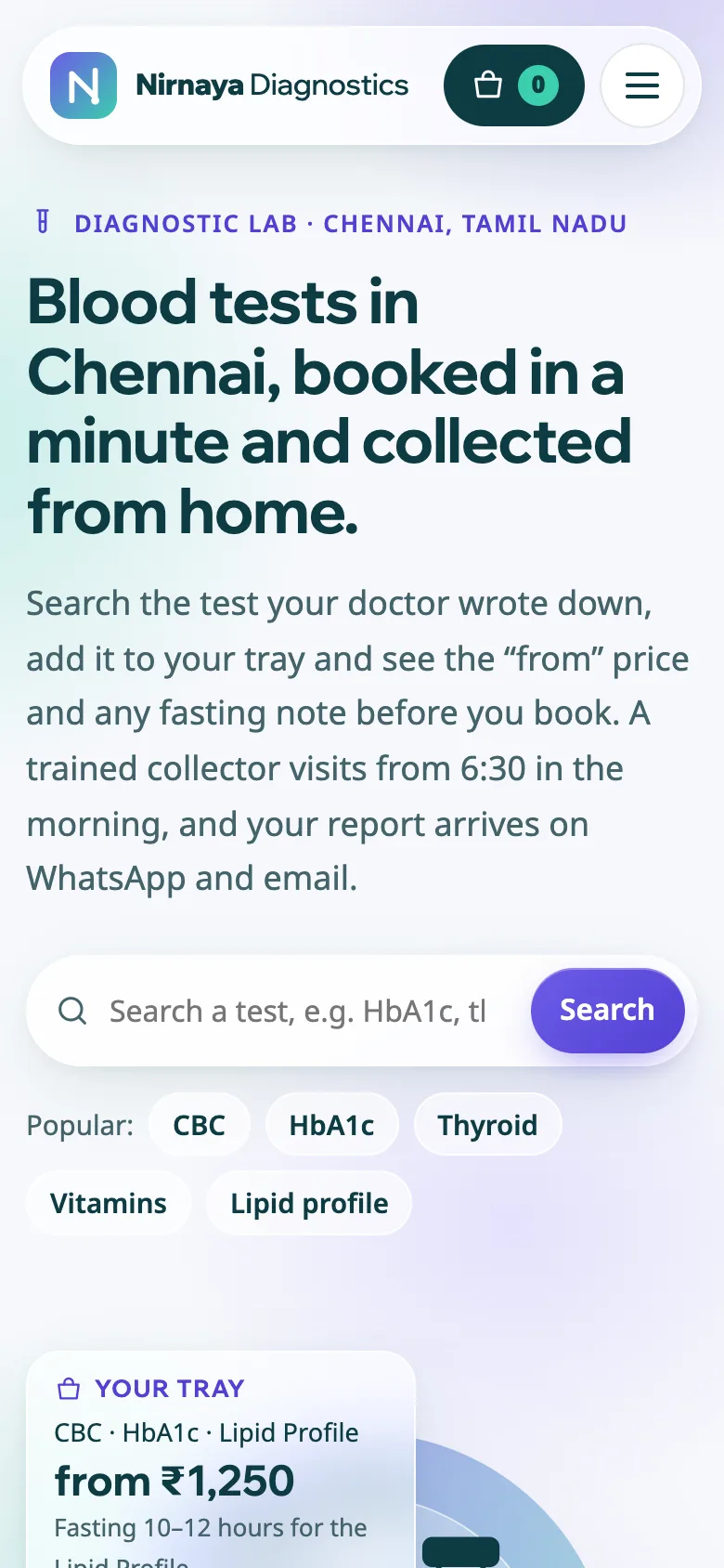
The design follows a soft, clean health-tech look: translucent glass panels on a gradient background, rounded chips and a floating header with a tray counter. On phones the tray becomes a slim bar above the bottom of the screen, so the total and the Book button are always one tap away.
Local search set-up
Labs compete on searches such as "blood test near me", "home sample collection" and a test name plus the city. The demo gives each of those intents its own page with a focused title and description, and marks the business up as a DiagnosticLab with opening hours and a city-level service area. The test menu and packages carry OfferCatalog data, and the home collection page describes the service and the area it covers.
For a real lab I add the full address, a map, the Google Business Profile link and the branch list, and I write area pages only where you actually run collection routes.
India
The demo is written in Indian English for Chennai, with prices shown as "from" figures in rupees and phone numbers masked on the demo. Collection areas are described by six-digit pincodes, which is how patients think about coverage, and WhatsApp is the main channel for confirmations and reports. Early morning slots matter because many tests need an overnight fast. NABL accreditation, clinical establishment registration and the signing pathologist's details have dedicated places once you send them. A Tamil version of the key pages can follow, with its own addresses and language tags, when the lab is ready for it.