What clients look for on an interior designer's website
Someone looking for an interior designer is rarely in a hurry, but they are judging you from the first scroll. They want to know whether your taste matches theirs, whether you work on homes like theirs (a terrace, an apartment, a new build), roughly what it will cost to start, and what actually happens after they get in touch. Most of them have spent months saving pictures, so they are not short of inspiration. What they lack is confidence that a designer will listen, stay within budget and see the job through.
A gallery of beautiful rooms answers only the first question. The websites that turn visitors into consultations also show how the studio thinks: why a sofa was chosen, what the benchtop is made of, how a narrow plan was opened up. That detail is what separates a designer from a mood board, and it is the part most interior design websites leave out.
How the demo handles it
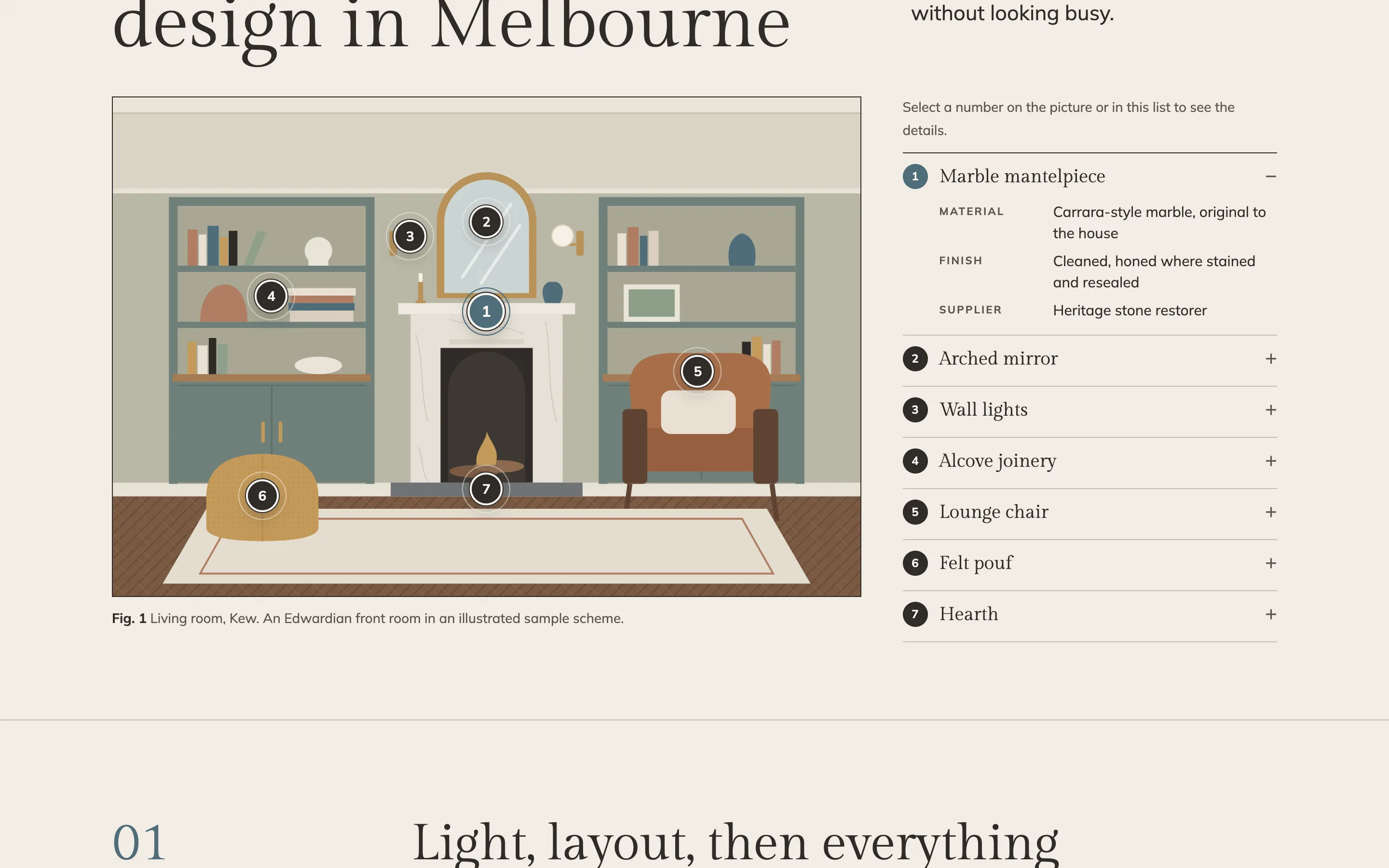
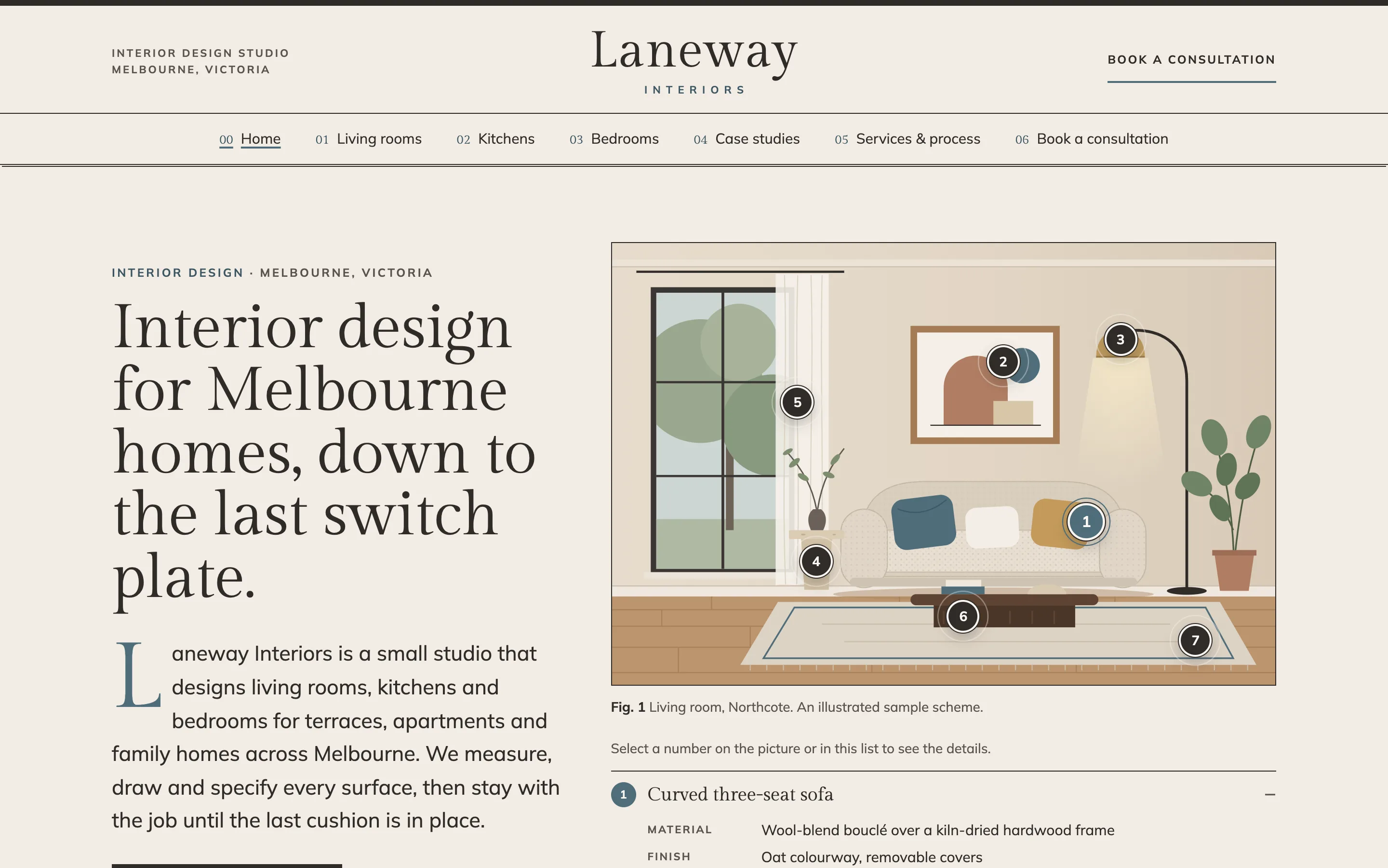
Laneway Interiors is a fictional studio in Melbourne. Its signature feature is the room with hotspots: every room page carries a drawing with numbered dots, and tapping a dot reveals the piece, its material, its finish and the type of maker who supplies it. A curved sofa becomes "wool-blend bouclé over a kiln-dried hardwood frame, made to order by a Melbourne upholsterer". Visitors explore the room the way they would in a showroom, and they learn how much thought goes into it.
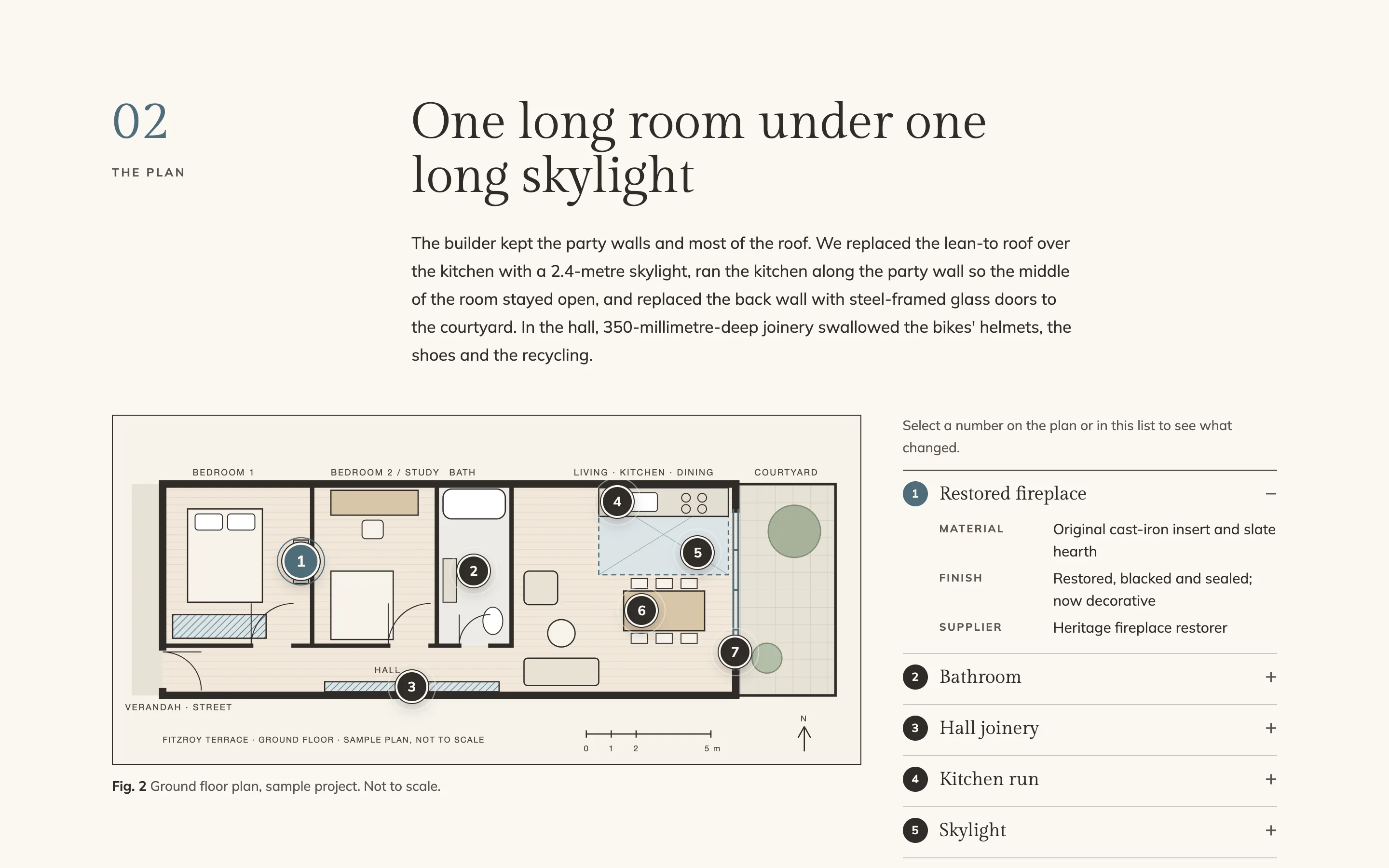
The hotspots are proper buttons. They work with a mouse, a finger or the keyboard, they announce their state to screen readers, and the full list of pieces is printed beside the picture, so nothing is hidden if JavaScript fails. The same component runs on the floor plans in the case studies, where each number explains one design decision: the skylight, the hall joinery, the arch where a wall used to be.
The look follows an interiors magazine: large serif headlines, asymmetric columns, pull quotes, numbered sections and captions under every figure. It suits a business whose product is taste, and it gives long pages a rhythm that keeps people reading.
The pages
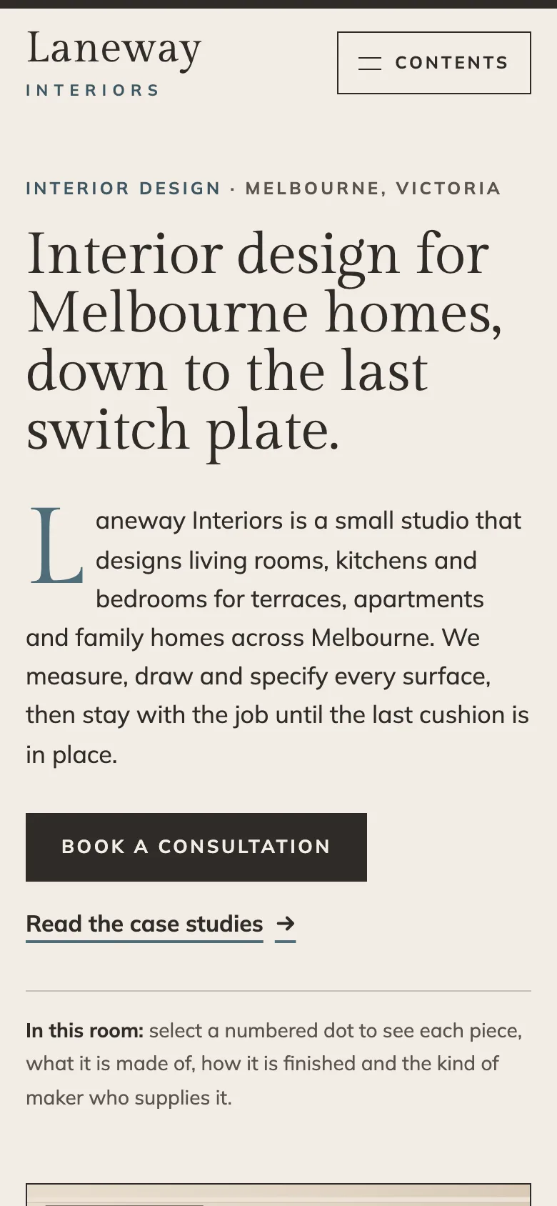
The home page introduces the studio with an interactive living room, then reads like a contents page: one entry for each room type, two sample projects, the four stages of the process, from fees and the parts of Melbourne the studio covers. Separate pages for living rooms, kitchens and bedrooms each open with their own hotspot room and then explain what is included and how long it usually takes. The kitchen page also explains how the designer works alongside builders and cabinetmakers, which is the question most kitchen clients ask first.
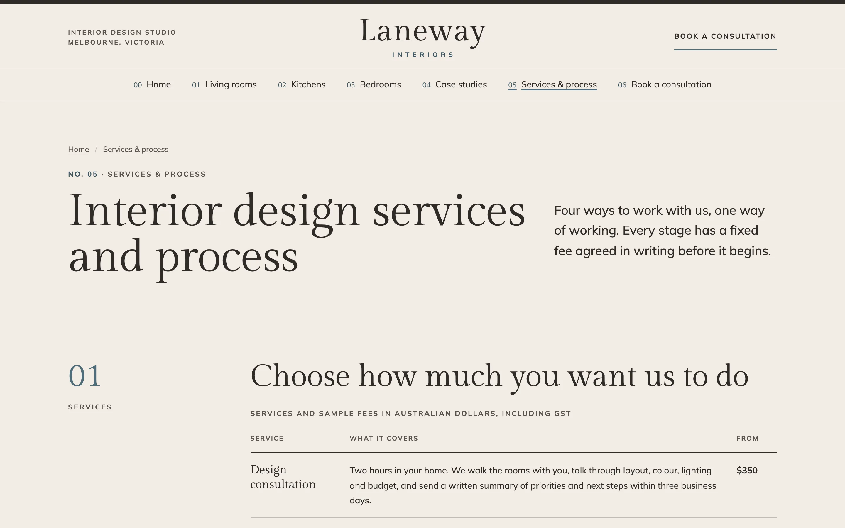
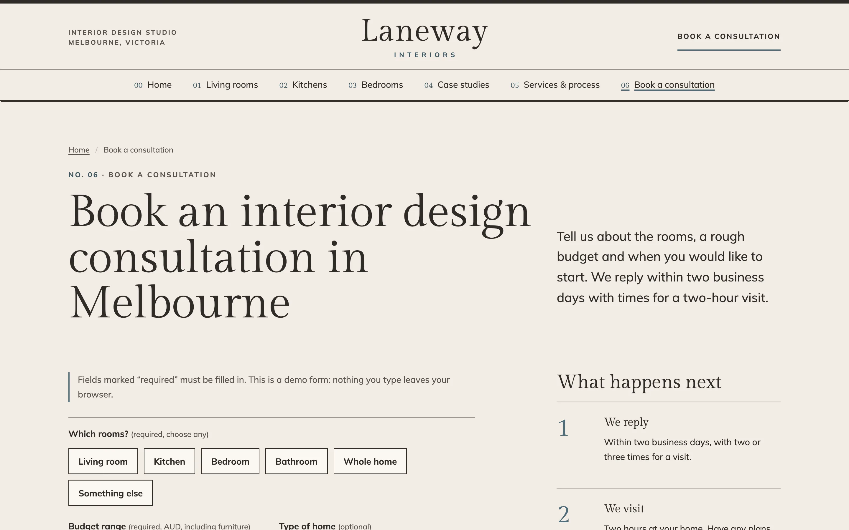
The case studies follow one structure: the brief in the client's words, the plan with hotspots, the materials palette shown as swatches, and the outcome. Clients appear by first name only, and every case study is clearly labelled as a sample. Services & process sets out four ways to work with the studio, six steps with typical weeks, and honest answers about commissions and trade pricing. Book consultation asks for room types, a budget range in dollars, a timeline, the suburb and contact details, checks every answer in the browser and focuses the first problem so nobody is left guessing.
Local SEO set-up for an interior designer
Every page carries ProfessionalService structured data with the studio's area served, opening hours, logo and share image, plus Service nodes for each room type and service, and breadcrumbs on inner pages. Titles combine the service, the city and the brand ("Kitchen Interior Design in Melbourne"), and each page targets one search: living room design, kitchen design, bedroom design, case studies and consultation. The home page lists the suburbs the studio works in, which supports searches such as "interior designer Northcote" without creating thin pages for every suburb.
For a real studio, the next steps are a Google Business Profile set up as a service-area business, the same name and phone number everywhere, and new case studies added as projects finish. Each case study is a page that can rank for the suburb and the type of home, and gives you something to share.
Country notes
India
Write in Indian English and show fees in rupees, with lakh where clients expect it for full-home projects. WhatsApp should be the main contact button, since most clients will message before they call, and budget ranges should reflect turnkey work, which is common. Add a GST number placeholder and mention UPI for consultation fees. Apartment interiors in new towers are a large share of the market, so a page for handover-ready flats often works well.
USA
Use US English and dollars, and expect clients to search by neighborhood and ZIP code as well as city. Some states regulate the title "interior designer", so the copy should match your registration or say "interior design studio". WCAG 2.2 AA accessibility, which the demo meets, also lowers the risk of ADA website claims. Show square feet rather than square metres.
Canada
Write in Canadian English (colour, centre) and show fees in Canadian dollars, with metric measurements and imperial where trades still use it. A studio serving Québec needs a French version under the Charter of the French Language, and the layout already allows a language switcher. Winter light and heating are real design drivers in Canadian homes, so room pages that discuss them read as local.
Australia
The demo is written for Australia: Australian English, dollars including GST, metric units and an ABN placeholder in the footer. Clients expect designers to work with registered builders, and the kitchen page explains that split clearly. Suburb names carry a lot of meaning in Australian cities, so a list of the areas you cover is worth more than a long paragraph about the whole city.
Finland
A Finnish studio needs the site in Finnish and English, with Finnish at /fi/ and matching pages in both. Fees are shown as 1 234,50 €, and a Y-tunnus placeholder goes in the footer. Finnish clients value calm, functional rooms and honest materials, which suits the hotspot format. EU accessibility rules make WCAG 2.2 AA a requirement rather than a nice extra.