A spa website should make choosing feel easy
A visitor considering a day spa is often trying to answer a small set of practical questions. What does the treatment involve, how long should they allow, and can they ask about comfort before booking? A beautiful photograph cannot answer those questions by itself. A useful spa website pairs a calm visual pace with specific treatment descriptions and an obvious route to an enquiry. It should make room for first-time visitors who may not know the difference between a facial, a body ritual and a package.
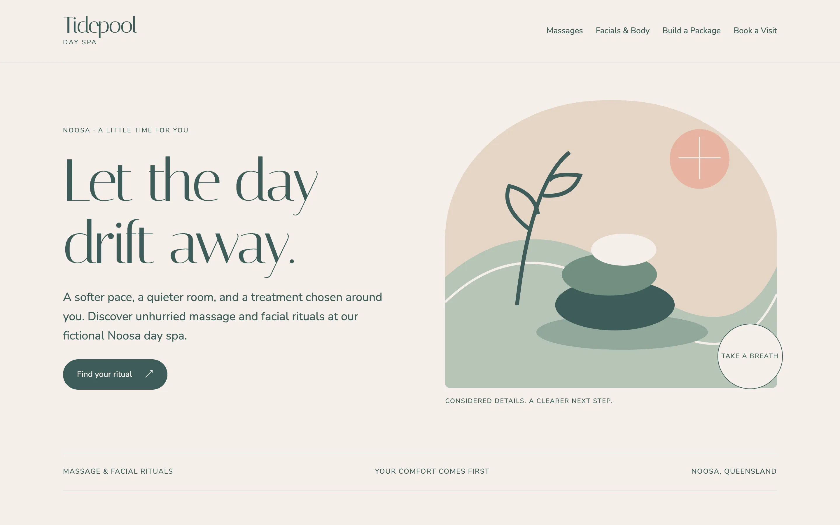
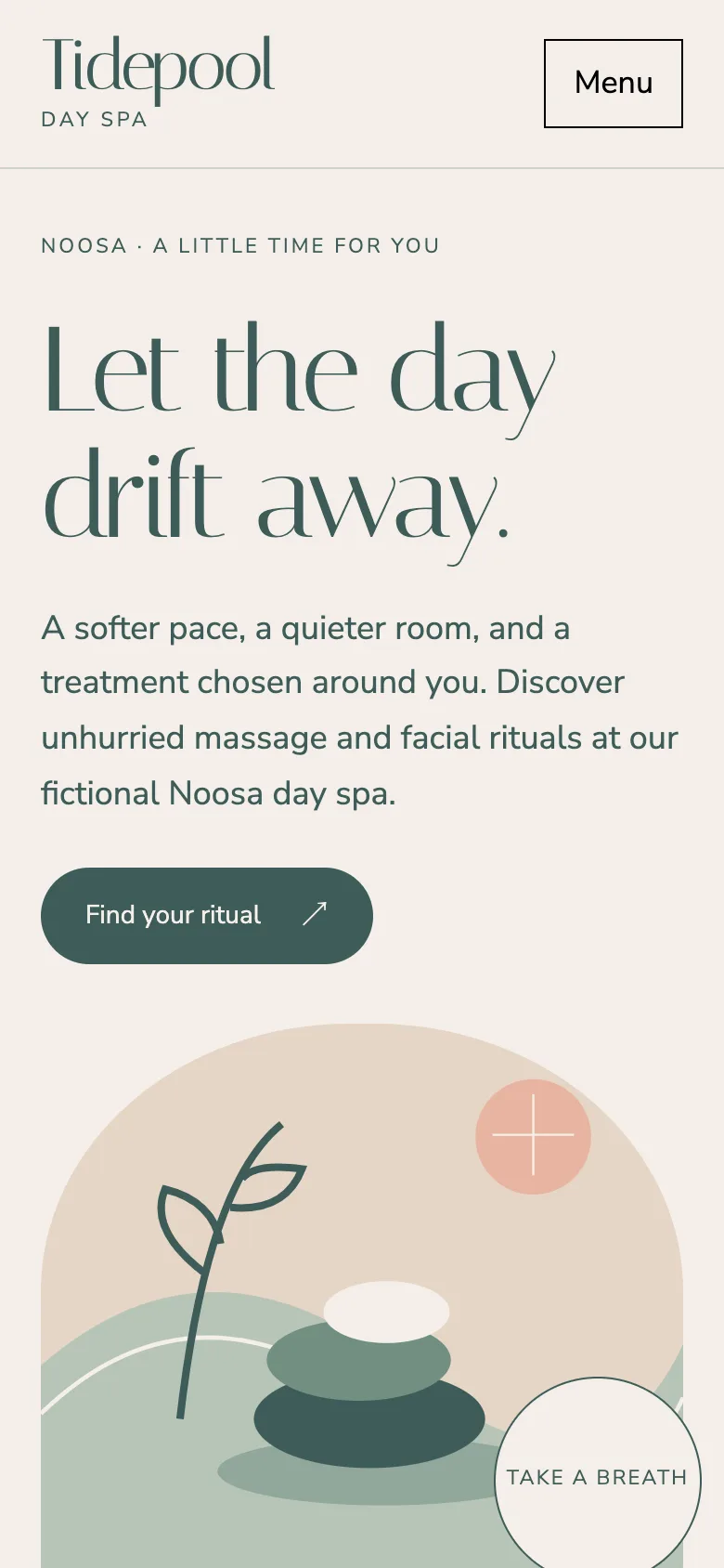
Tidepool Day Spa is a fictional Noosa business designed around that decision. Its muted green, sand and peach palette carries an original illustration of stones, water and a botanical stem. Large Italiana headings create a quieter rhythm, while Nunito Sans keeps the service details readable. The home page introduces the experience without claiming medical outcomes, presenting invented awards or using a real person's photograph as a therapist. Each treatment has a clear next step, and the enquiry remains separate from confirmed availability.
Let visitors shape a treatment combination
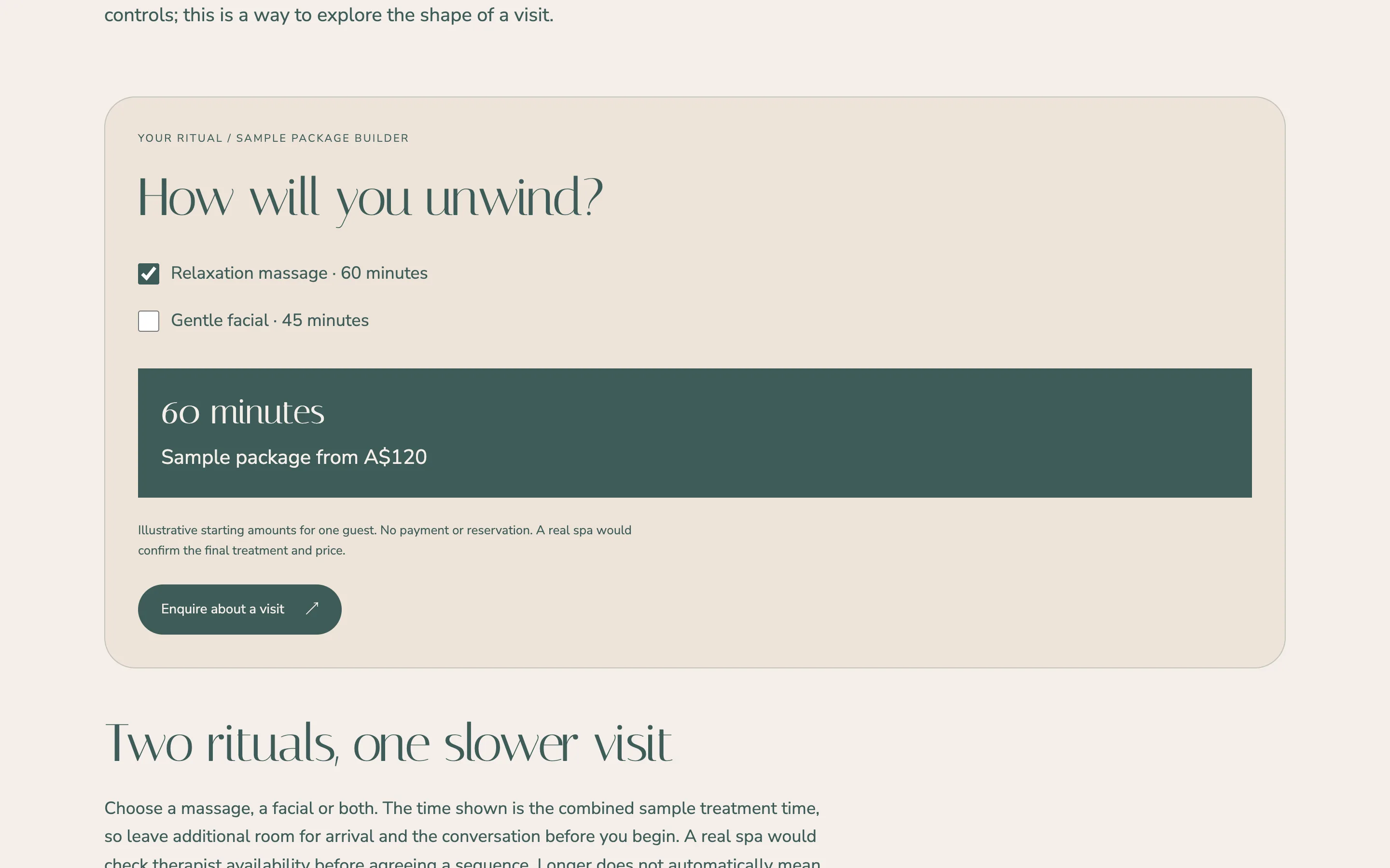
The signature feature is a small package builder. A visitor can select a relaxation massage, a gentle facial or both. The duration and illustrative starting amount update immediately, making the consequence of each choice visible. Deselecting both treatments produces a useful prompt instead of leaving a misleading total. The controls use native checkboxes, so the same interaction works with a keyboard and on a phone. The result is announced when it changes for assistive technology users.
This is deliberately a planning tool. It does not charge a card, reserve a therapist or imply that a room is available. The accompanying copy explains that a real spa would confirm the sequence, suitability and final amount. That distinction helps a prospective owner see how a simple website can support a conversation without requiring a full booking platform. A commissioned version could later connect the approved treatment menu to the owner's chosen scheduling system, with its real availability and cancellation process.
Five pages with a clear role
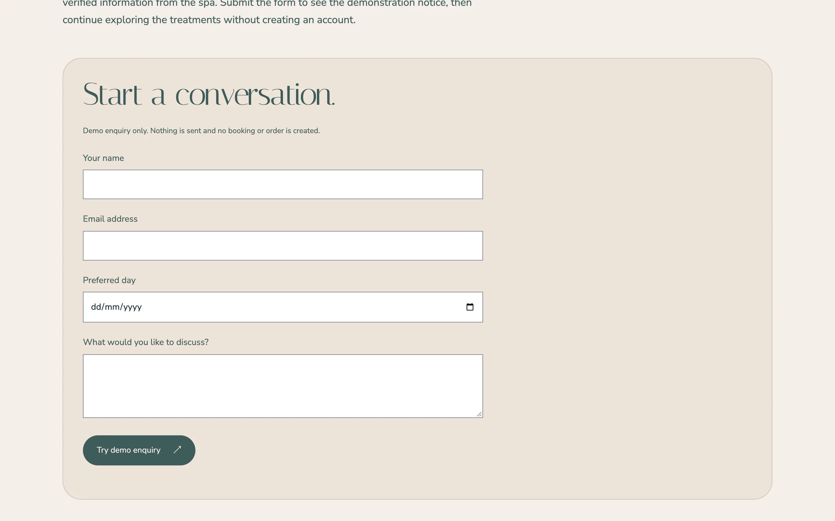
Home establishes the place and the tone. Massages explains pressure preferences, treatment time and how a visitor can ask for a pause. Facials and Body describes a gentle experience without promising a transformation. Build a Package provides the interactive comparison and its limitations. Book a Visit collects a name, email, preferred day and message. The custom not-found page carries the same design and gives a straightforward way back to the home page.
The form does not collect medical records, photographs or payment information. It validates the required fields, focuses the first invalid control and shows the exact demonstration notice after a valid submission. Nothing is sent. The layout stays readable without JavaScript, and the navigation is available even if scripting fails. On smaller screens, the columns become a single reading sequence rather than compressing treatment descriptions into narrow tiles.
Search foundations for a real spa
The demo includes individual titles and descriptions, canonical URLs, social sharing images and a single structured data graph per page. DaySpa identifies the fictional business, while service and breadcrumb nodes provide context on inner pages. The server keeps the demo out of search results and injects the existing Smit Desai demo notice. The public industry page provides the searchable description of the website design service. A real spa launch would replace the fictional identity, verify the service menu and use actual opening hours and contact information.
Adapting the spa website by market
Australia
The Noosa example uses Australian English and Australian-dollar sample amounts. A real spa would supply its treatment descriptions, confirmed contact details and access information. Booking terms should come from the operator rather than a generic template. The soft illustration can be replaced by licensed photographs of the actual rooms once permission and suitable files are available.
Canada
A Canadian version can use Canadian English and Canadian dollars, with the location and seasonal visitor information written for the actual spa. If a French version is needed, the navigation, treatment names and booking messages should all be translated together. The package builder can retain the same simple interaction while using the approved local menu.
USA
For a US spa, the website can show dollar amounts with a clear currency label and explain treatment durations in the same direct way. Local contact information and accessibility details should be verified before launch. Gift enquiries should remain visibly different from a purchase unless a real gift-card system has been connected.
India
An Indian spa version can use rupees and an approved WhatsApp enquiry route. The treatment comparison should still explain what is included rather than relying on a package name. A real operator can decide whether appointment requests go to email, a booking service or its customer management system.
Finland
A Finnish spa can offer Finnish and English, with euro amounts and matching treatment information in both languages. Translation should include the form feedback and the package summary, not just headings. This sample demonstrates the English experience; a local version would be reviewed with the spa before publication.